Package-level declarations

IconButtons take supplementary actions with a single tap. They're used when a compact button is required, such as in a toolbar or image list.

Styles

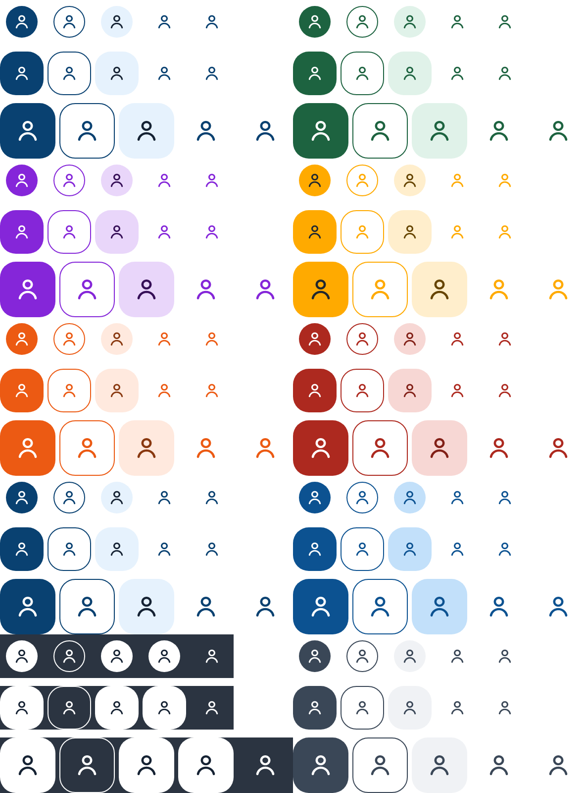
Icon buttons come in various styles:

  • Filled

  • Tinted

  • Outlined

  • Contrast

  • Ghost

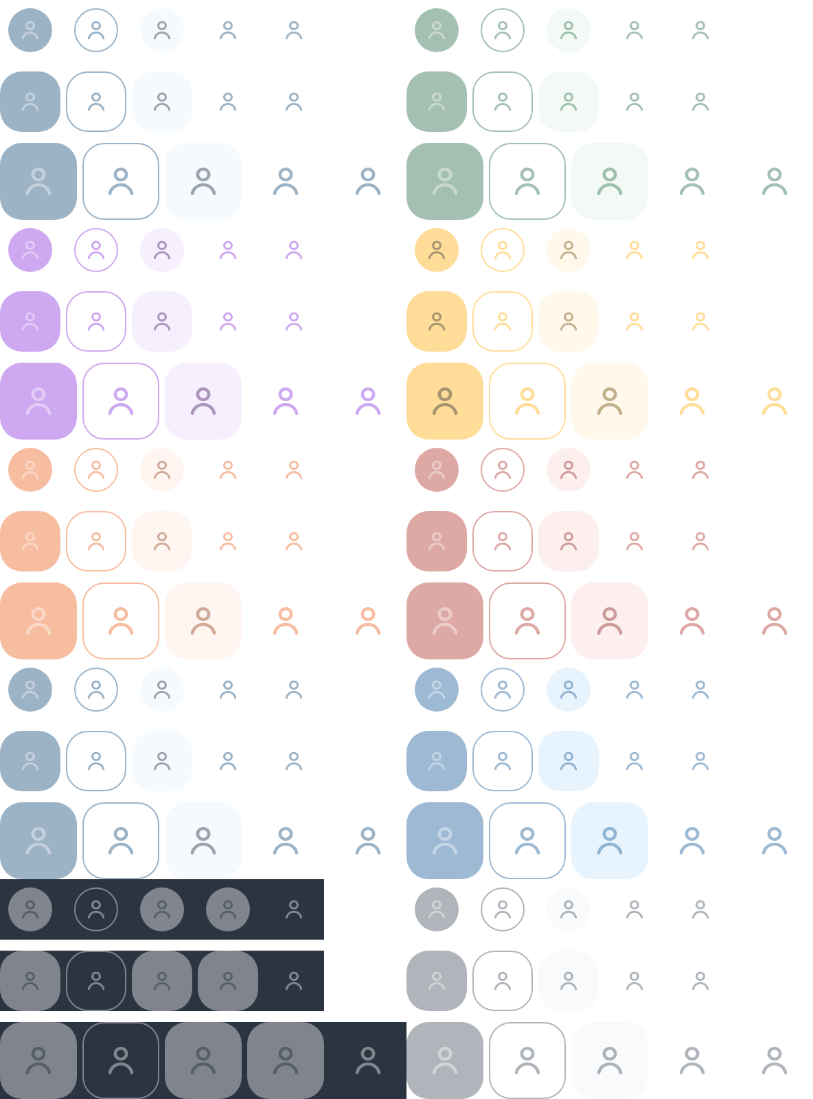
EnabledDisabledShapes

Sizes

Icon buttons come in 3 sizes IconButtonSize:

  • small - 32.dp (however, the minimum touch size is applied and is 44.dp)

  • medium - 44.dp (default)

  • large - 56.dp

The content icon is 16.dp for IconButtonSize.Small and IconButtonSize.Medium, and 24.dp for IconButtonSize.Large

Shapes

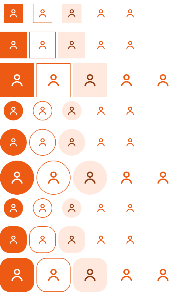
Icon buttons come in 3 shapes ButtonShape:

  • Square

  • Rounded (default)

  • Pill

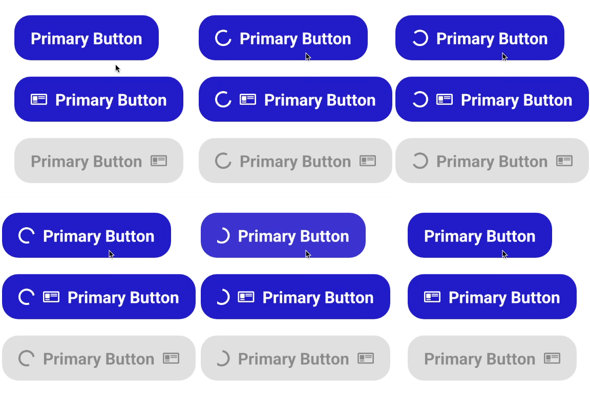
The buttons have an loading state that can be used to indicate that the button is loading some data and show/hide an indeterminate circular progress indicator on the start of the button.
Intents

Icon Buttons support all intents:

  • Support (default)

  • Accent

  • Main

  • Success

  • Alert

  • Danger

  • Info

  • Neutral

  • Surface

  • Ai

IconButtonFilled

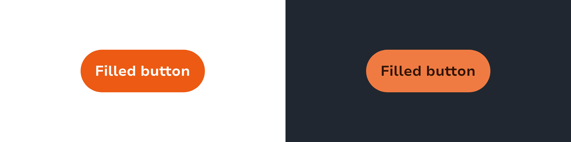
Filled icon buttons are the standard for most use cases. The filled styling places the most emphasis and should be used for important actions.

fun IconButtonFilled(
icon: SparkIcon,
onClick: () -> Unit,
)

IconButtonOutlined

Outlined icon buttons are used for support actions. The outlined styling places less emphasis on these actions that are important but not the main ones.

Be aware that it's not advised to use it on top of images since it will be hard to see.

fun IconButtonOutlined(
icon: SparkIcon,
onClick: () -> Unit,
)

IconButtonTinted

Tinted icon buttons are medium-emphasis buttons that is an alternative middle ground between default filled icon buttons and outlined icon buttons. They can be used in contexts where lower-priority icon button requires slightly more emphasis than an outline would give.

fun IconButtonTinted(
icon: SparkIcon,
onClick: () -> Unit,
)

IconButtonGhost

Ghost icon buttons are used for the lowest priority actions, especially when presenting multiple options.

Ghost icon buttons can be placed on a variety of backgrounds. Until the button is interacted with, its container isn't visible. This button style is often used inside other components like snackbars, dialogs, and cards.

fun IconButtonGhost(
icon: SparkIcon,
onClick: () -> Unit,
)

IconButtonContrast

Contrast icon buttons are used for the high to mid priority actions when the background is dark like on an image or a video.

fun IconButtonContrast(
icon: SparkIcon,
onClick: () -> Unit,
)

Buttons help people take action, such as sending an email, sharing a document, or liking a comment. Buttons communicate actions that users can take. They are typically placed throughout your UI, in places like:

  • Dialogs

  • Modal windows

  • Forms

  • Cards

  • Toolbars

Button API

Buttons are accessed as extension functions on the Button object. Each variant accepts either a text: String parameter or a content: @Composable RowScope.() -> Unit slot for custom content.

Button.Primary(
onClick = { /*Click event*/ },
text = "Main",
)

All variants share these common parameters:

ParameterDescription
onClickCalled when the user clicks the button
modifierModifier applied to the button
sizeButton size (ButtonSize.Small, Medium, Large)
enabledControls the enabled state
iconOptional icon at the start or end of the button
iconSideSide where the icon is displayed (IconSide.START or END)
isLoadingShows a circular progress indicator
interactionSourceStream of interactions for custom appearance

The buttons have a loading state that can be used to indicate that the button is loading some data and show/hide an indeterminate circular progress indicator on the start of the button.

Variants

VariantPurpose
Button.PrimaryUsed once per view (not including a modal dialog), these buttons have the most emphasis. It should never be doubled up to sit side by side. Used when an action is clearly more important than others and you need to draw attention to it.
Button.SecondaryThe standard button for most use cases. The filled styling places less emphasis than Primary but still signals an important action.
Button.TertiaryUsed for miscellaneous actions: the action is important, but may not be what the user is looking to do right then. Often paired with a Primary or Secondary button.
Button.BoostUsed for any action attached to a conversion or monetisation flow, such as "Boost my ad" or "Upgrade".
Button.AiUsed for AI-powered actions. Always displays the Sparks icon to signal AI involvement.
Button.DangerUsed for destructive or irreversible actions like "Delete" or "Remove". Warns the user of negative consequences.
Button.SuccessUsed for positive confirmations like "Approve" or "Mark as sold" where the outcome is beneficial.
Button.ContrastUsed for primary actions on dark media or dark backgrounds.
Button.TextUsed for the most minor actions. Often paired with a Primary button. Can be used with Secondary and Tertiary buttons when the primary action is for forwarding.
Button.UnderlinedUsed for link-style actions within body text, such as "Terms and conditions" or "Privacy policy".
ButtonGhostUsed for the most minor actions, especially when presenting multiple options. The container is not visible until interaction.

Button.Primary

Button.Primary(
onClick = { /*Click event*/ },
text = "Main",
)

Button.Secondary

Button.Secondary(
onClick = { /*Click event*/ },
text = "Secondary",
)

Button.Tertiary

Button.Tertiary(
onClick = { /*Click event*/ },
text = "Tertiary",
)

Button.Boost

Button.Boost(
onClick = { /*Click event*/ },
text = "Boost",
)

Button.Ai

Button.Ai(
onClick = { /*Click event*/ },
text = "Ask AI",
)

Button.Danger

Button.Danger(
onClick = { /*Click event*/ },
text = "Delete",
)

Button.Success

Button.Success(
onClick = { /*Click event*/ },
text = "Confirm",
)

Button.Contrast

Button.Contrast(
onClick = { /*Click event*/ },
text = "Contrast",
)

Button.Text

Button.Text(
onClick = { /*Click event*/ },
text = "Learn more",
)

Button.Underlined

Button.Underlined(
onClick = { /*Click event*/ },
text = "Terms and conditions",
)

Legacy API

The following top-level composable functions remain available:

LegacyReplacement
ButtonFilledButton.Primary
ButtonOutlinedButton.Tertiary
ButtonTinted(no direct replacement)
ButtonGhostButtonGhost (unchanged)
ButtonContrastButton.Contrast

ButtonFilled

Filled buttons are the standard button for most use cases. The filled styling places the most emphasis and should be used for important, final actions.

ButtonFilled(
text = "Main",
onClick = { /*Click event*/ },
)

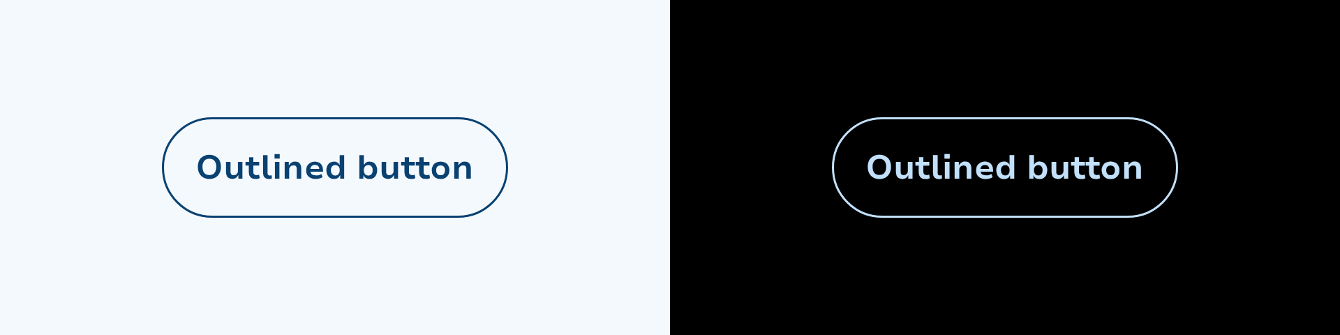
ButtonOutlined

Outlined buttons are used for support actions. The outlined styling places less emphasis on these actions that are important but not the main ones.

ButtonOutlined(
text = "Main",
onClick = { /*Click event*/ },
)

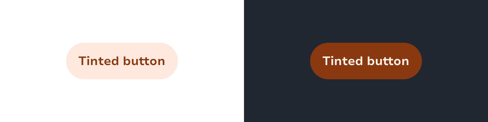
ButtonTinted

Tinted buttons are medium-emphasis buttons. An alternative middle ground between filled and outlined buttons.

ButtonTinted(
text = "Main",
onClick = { /*Click event*/ },
)

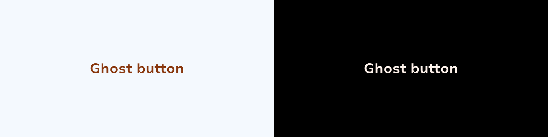
ButtonGhost

Ghost buttons are used for the lowest priority actions. The container is not visible until interaction.

ButtonGhost(
text = "Main",
onClick = { /*Click event*/ },
)

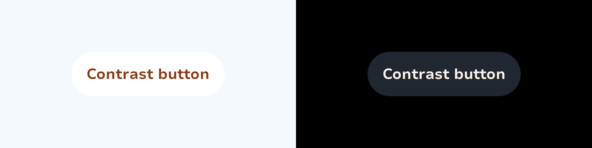
ButtonContrast

Contrast buttons are used for high to mid priority actions on dark backgrounds.

ButtonContrast(
text = "Main",
onClick = { /*Click event*/ },
)

Types

Link copied to clipboard

ButtonIntent is used to define the intent of the buttons.

Link copied to clipboard

ButtonSize is used to define the height of the buttons.

Link copied to clipboard

Component tokens for button components. Centralises all flag-driven token resolution so that each button variant reads from a single source of truth instead of inlining the flag check at every call site. When the rebranding feature flag is eventually removed, only this file changes.

Link copied to clipboard

Functions

Link copied to clipboard
fun Button.Ai(onClick: () -> Unit, modifier: Modifier = Modifier, size: ButtonSize = ButtonSize.Medium, enabled: Boolean = true, icon: SparkIcon? = LeboncoinIcons.Sparks, iconSide: IconSide = IconSide.START, isLoading: Boolean = false, interactionSource: MutableInteractionSource = remember { MutableInteractionSource() }, atEnd: Boolean = false, content: @Composable RowScope.() -> Unit)
fun Button.Ai(onClick: () -> Unit, text: String, modifier: Modifier = Modifier, size: ButtonSize = ButtonSize.Medium, enabled: Boolean = true, icon: SparkIcon? = LeboncoinIcons.Sparks, iconSide: IconSide = IconSide.START, isLoading: Boolean = false, interactionSource: MutableInteractionSource = remember { MutableInteractionSource() }, atEnd: Boolean = false)

Used for AI-powered actions. Always displays the Sparks icon to signal AI involvement.

Link copied to clipboard
fun Button.Boost(onClick: () -> Unit, modifier: Modifier = Modifier, size: ButtonSize = ButtonSize.Medium, enabled: Boolean = true, icon: SparkIcon? = null, iconSide: IconSide = IconSide.START, isLoading: Boolean = false, interactionSource: MutableInteractionSource = remember { MutableInteractionSource() }, atEnd: Boolean = false, content: @Composable RowScope.() -> Unit)
fun Button.Boost(onClick: () -> Unit, text: String, modifier: Modifier = Modifier, size: ButtonSize = ButtonSize.Medium, enabled: Boolean = true, icon: SparkIcon? = null, iconSide: IconSide = IconSide.START, isLoading: Boolean = false, interactionSource: MutableInteractionSource = remember { MutableInteractionSource() }, atEnd: Boolean = false)

Used for any action attached to a conversion or monetisation flow, such as "Boost my ad" or "Upgrade".

Link copied to clipboard
fun ButtonContrast(onClick: () -> Unit, text: AnnotatedString, modifier: Modifier = Modifier, size: ButtonSize = ButtonSize.Medium, intent: ButtonIntent = ButtonIntent.Main, enabled: Boolean = true, icon: SparkIcon? = null, iconSide: IconSide = IconSide.START, isLoading: Boolean = false, interactionSource: MutableInteractionSource = remember { MutableInteractionSource() }, atEnd: Boolean = false)
fun ButtonContrast(onClick: () -> Unit, modifier: Modifier = Modifier, size: ButtonSize = ButtonSize.Medium, shape: ButtonShape = SparkButtonDefaults.DefaultShape, intent: ButtonIntent = ButtonIntent.Main, enabled: Boolean = true, icon: SparkIcon? = null, iconSide: IconSide = IconSide.START, isLoading: Boolean = false, interactionSource: MutableInteractionSource = remember { MutableInteractionSource() }, atEnd: Boolean = false, content: @Composable RowScope.() -> Unit)

Contrast buttons are used on coloured or image backgrounds where standard buttons lack visibility.

fun ButtonContrast(onClick: () -> Unit, text: String, modifier: Modifier = Modifier, size: ButtonSize = ButtonSize.Medium, shape: ButtonShape = SparkButtonDefaults.DefaultShape, intent: ButtonIntent = ButtonIntent.Main, enabled: Boolean = true, icon: SparkIcon? = null, iconSide: IconSide = IconSide.START, isLoading: Boolean = false, interactionSource: MutableInteractionSource = remember { MutableInteractionSource() }, atEnd: Boolean = false)

Ghost buttons are used for the lowest priority actions, especially when presenting multiple options.

Link copied to clipboard
fun ButtonFilled(onClick: () -> Unit, modifier: Modifier = Modifier, size: ButtonSize = ButtonSize.Medium, shape: ButtonShape = SparkButtonDefaults.DefaultShape, intent: ButtonIntent = ButtonIntent.Main, enabled: Boolean = true, icon: SparkIcon? = null, iconSide: IconSide = IconSide.START, isLoading: Boolean = false, interactionSource: MutableInteractionSource = remember { MutableInteractionSource() }, content: @Composable RowScope.() -> Unit)
fun ButtonFilled(onClick: () -> Unit, text: AnnotatedString, modifier: Modifier = Modifier, size: ButtonSize = ButtonSize.Medium, intent: ButtonIntent = ButtonIntent.Main, enabled: Boolean = true, icon: SparkIcon? = null, iconSide: IconSide = IconSide.START, isLoading: Boolean = false, interactionSource: MutableInteractionSource = remember { MutableInteractionSource() }, atEnd: Boolean = false)
fun ButtonFilled(onClick: () -> Unit, text: String, modifier: Modifier = Modifier, size: ButtonSize = ButtonSize.Medium, shape: ButtonShape = SparkButtonDefaults.DefaultShape, intent: ButtonIntent = ButtonIntent.Main, enabled: Boolean = true, icon: SparkIcon? = null, iconSide: IconSide = IconSide.START, isLoading: Boolean = false, interactionSource: MutableInteractionSource = remember { MutableInteractionSource() }, atEnd: Boolean = false)

The filled button should only be used once per view (not including a modal dialog), these buttons have the most emphasis.

Link copied to clipboard
fun ButtonGhost(onClick: () -> Unit, modifier: Modifier = Modifier, size: ButtonSize = ButtonSize.Medium, shape: ButtonShape = SparkButtonDefaults.DefaultShape, intent: ButtonIntent = ButtonIntent.Main, enabled: Boolean = true, icon: SparkIcon? = null, iconSide: IconSide = IconSide.START, isLoading: Boolean = false, interactionSource: MutableInteractionSource = remember { MutableInteractionSource() }, atEnd: Boolean = false, content: @Composable RowScope.() -> Unit)
fun ButtonGhost(onClick: () -> Unit, text: AnnotatedString, modifier: Modifier = Modifier, size: ButtonSize = ButtonSize.Medium, shape: ButtonShape = SparkButtonDefaults.DefaultShape, intent: ButtonIntent = ButtonIntent.Main, enabled: Boolean = true, icon: SparkIcon? = null, iconSide: IconSide = IconSide.START, isLoading: Boolean = false, interactionSource: MutableInteractionSource = remember { MutableInteractionSource() }, atEnd: Boolean = false)
fun ButtonGhost(onClick: () -> Unit, text: String, modifier: Modifier = Modifier, size: ButtonSize = ButtonSize.Medium, shape: ButtonShape = SparkButtonDefaults.DefaultShape, intent: ButtonIntent = ButtonIntent.Main, enabled: Boolean = true, icon: SparkIcon? = null, iconSide: IconSide = IconSide.START, isLoading: Boolean = false, interactionSource: MutableInteractionSource = remember { MutableInteractionSource() }, atEnd: Boolean = false)

The ghost button is the button for non important actions. The mandatory icon help to indicate that it's a clickable text

Link copied to clipboard
fun ButtonOutlined(onClick: () -> Unit, text: AnnotatedString, modifier: Modifier = Modifier, size: ButtonSize = ButtonSize.Medium, intent: ButtonIntent = ButtonIntent.Support, enabled: Boolean = true, icon: SparkIcon? = null, iconSide: IconSide = IconSide.START, isLoading: Boolean = false, interactionSource: MutableInteractionSource = remember { MutableInteractionSource() }, atEnd: Boolean = false)
fun ButtonOutlined(onClick: () -> Unit, text: String, modifier: Modifier = Modifier, size: ButtonSize = ButtonSize.Medium, shape: ButtonShape = SparkButtonDefaults.DefaultShape, intent: ButtonIntent = ButtonIntent.Support, enabled: Boolean = true, icon: SparkIcon? = null, iconSide: IconSide = IconSide.START, isLoading: Boolean = false, interactionSource: MutableInteractionSource = remember { MutableInteractionSource() }, atEnd: Boolean = false)

Outlined buttons are used for support actions. The outlined styling places less emphasis on these actions that are important but not the main ones. It is recommended to pair it with a button wit more emphasis like the filled button or the tinted button.

fun ButtonOutlined(onClick: () -> Unit, modifier: Modifier = Modifier, size: ButtonSize = ButtonSize.Medium, shape: ButtonShape = SparkButtonDefaults.DefaultShape, intent: ButtonIntent = ButtonIntent.Support, enabled: Boolean = true, icon: SparkIcon? = null, iconSide: IconSide = IconSide.START, isLoading: Boolean = false, interactionSource: MutableInteractionSource = remember { MutableInteractionSource() }, atEnd: Boolean = false, content: @Composable RowScope.() -> Unit)

Outlined buttons are used for support actions. The outlined styling places less emphasis on these actions that are ` important but not the main ones. It is recommended to pair it with a button wit more emphasis like the filled button or the tinted button.

Link copied to clipboard
fun ButtonTinted(onClick: () -> Unit, modifier: Modifier = Modifier, size: ButtonSize = ButtonSize.Medium, shape: ButtonShape = SparkButtonDefaults.DefaultShape, intent: ButtonIntent = ButtonIntent.Main, enabled: Boolean = true, icon: SparkIcon? = null, iconSide: IconSide = IconSide.START, isLoading: Boolean = false, interactionSource: MutableInteractionSource = remember { MutableInteractionSource() }, atEnd: Boolean = false, content: @Composable RowScope.() -> Unit)
fun ButtonTinted(onClick: () -> Unit, text: AnnotatedString, modifier: Modifier = Modifier, size: ButtonSize = ButtonSize.Medium, shape: ButtonShape = SparkButtonDefaults.DefaultShape, intent: ButtonIntent = ButtonIntent.Main, enabled: Boolean = true, icon: SparkIcon? = null, iconSide: IconSide = IconSide.START, isLoading: Boolean = false, interactionSource: MutableInteractionSource = remember { MutableInteractionSource() }, atEnd: Boolean = false)
fun ButtonTinted(onClick: () -> Unit, text: String, modifier: Modifier = Modifier, size: ButtonSize = ButtonSize.Medium, shape: ButtonShape = SparkButtonDefaults.DefaultShape, intent: ButtonIntent = ButtonIntent.Main, enabled: Boolean = true, icon: SparkIcon? = null, iconSide: IconSide = IconSide.START, isLoading: Boolean = false, interactionSource: MutableInteractionSource = remember { MutableInteractionSource() }, atEnd: Boolean = false)

Tinted buttons are medium-emphasis buttons that is an alternative middle ground between default Buttons (filled) and Outlined buttons. They can be used in contexts where lower-priority button requires slightly more emphasis than an outline would give, such as "Next" in an onboarding flow.

Link copied to clipboard
fun Button.Contrast(onClick: () -> Unit, modifier: Modifier = Modifier, size: ButtonSize = ButtonSize.Medium, enabled: Boolean = true, icon: SparkIcon? = null, iconSide: IconSide = IconSide.START, isLoading: Boolean = false, interactionSource: MutableInteractionSource = remember { MutableInteractionSource() }, atEnd: Boolean = false, content: @Composable RowScope.() -> Unit)
fun Button.Contrast(onClick: () -> Unit, text: String, modifier: Modifier = Modifier, size: ButtonSize = ButtonSize.Medium, enabled: Boolean = true, icon: SparkIcon? = null, iconSide: IconSide = IconSide.START, isLoading: Boolean = false, interactionSource: MutableInteractionSource = remember { MutableInteractionSource() }, atEnd: Boolean = false)

Contrast buttons are used on coloured or image backgrounds where standard buttons lack visibility. They use a surface container to stand out against any background.

Link copied to clipboard
fun Button.Danger(onClick: () -> Unit, modifier: Modifier = Modifier, size: ButtonSize = ButtonSize.Medium, enabled: Boolean = true, icon: SparkIcon? = null, iconSide: IconSide = IconSide.START, isLoading: Boolean = false, interactionSource: MutableInteractionSource = remember { MutableInteractionSource() }, atEnd: Boolean = false, content: @Composable RowScope.() -> Unit)
fun Button.Danger(onClick: () -> Unit, text: String, modifier: Modifier = Modifier, size: ButtonSize = ButtonSize.Medium, enabled: Boolean = true, icon: SparkIcon? = null, iconSide: IconSide = IconSide.START, isLoading: Boolean = false, interactionSource: MutableInteractionSource = remember { MutableInteractionSource() }, atEnd: Boolean = false)

Used for destructive or irreversible actions like "Delete" or "Remove". Warns the user of negative consequences.

Link copied to clipboard
fun ExtendedFloatingActionButton(onClick: () -> Unit, modifier: Modifier = Modifier, shape: Shape = FloatingActionButtonDefaults.extendedFabShape, containerColor: Color = FloatingActionButtonDefaults.containerColor, contentColor: Color = contentColorFor(containerColor), elevation: FloatingActionButtonElevation = FloatingActionButtonDefaults.elevation(), interactionSource: MutableInteractionSource = remember { MutableInteractionSource() }, content: @Composable RowScope.() -> Unit)
fun ExtendedFloatingActionButton(text: @Composable () -> Unit, icon: SparkIcon, onClick: () -> Unit, modifier: Modifier = Modifier, expanded: Boolean = true, shape: Shape = FloatingActionButtonDefaults.extendedFabShape, containerColor: Color = FloatingActionButtonDefaults.containerColor, contentColor: Color = contentColorFor(containerColor), elevation: FloatingActionButtonElevation = FloatingActionButtonDefaults.elevation(), interactionSource: MutableInteractionSource = remember { MutableInteractionSource() })
Link copied to clipboard
fun FloatingActionButton(onClick: () -> Unit, icon: SparkIcon, contentDescription: String?, modifier: Modifier = Modifier, shape: Shape = FloatingActionButtonDefaults.shape, containerColor: Color = FloatingActionButtonDefaults.containerColor, contentColor: Color = contentColorFor(containerColor), elevation: FloatingActionButtonElevation = FloatingActionButtonDefaults.elevation(), interactionSource: MutableInteractionSource = remember { MutableInteractionSource() })
Link copied to clipboard
fun Button.Ghost(onClick: () -> Unit, modifier: Modifier = Modifier, size: ButtonSize = ButtonSize.Medium, enabled: Boolean = true, icon: SparkIcon? = null, iconSide: IconSide = IconSide.START, isLoading: Boolean = false, interactionSource: MutableInteractionSource = remember { MutableInteractionSource() }, atEnd: Boolean = false, content: @Composable RowScope.() -> Unit)
fun Button.Ghost(onClick: () -> Unit, text: String, modifier: Modifier = Modifier, size: ButtonSize = ButtonSize.Medium, enabled: Boolean = true, icon: SparkIcon? = null, iconSide: IconSide = IconSide.START, isLoading: Boolean = false, interactionSource: MutableInteractionSource = remember { MutableInteractionSource() }, atEnd: Boolean = false)

Ghost buttons are used for the lowest priority actions, especially when presenting multiple options. Until the button is interacted with, its container is not visible.

Link copied to clipboard
fun LargeFloatingActionButton(onClick: () -> Unit, icon: SparkIcon, contentDescription: String?, modifier: Modifier = Modifier, shape: Shape = FloatingActionButtonDefaults.largeShape, containerColor: Color = FloatingActionButtonDefaults.containerColor, contentColor: Color = contentColorFor(containerColor), elevation: FloatingActionButtonElevation = FloatingActionButtonDefaults.elevation(), interactionSource: MutableInteractionSource = remember { MutableInteractionSource() })
Link copied to clipboard
fun Button.Primary(onClick: () -> Unit, modifier: Modifier = Modifier, size: ButtonSize = ButtonSize.Medium, enabled: Boolean = true, icon: SparkIcon? = null, iconSide: IconSide = IconSide.START, isLoading: Boolean = false, interactionSource: MutableInteractionSource = remember { MutableInteractionSource() }, atEnd: Boolean = false, content: @Composable RowScope.() -> Unit)
fun Button.Primary(onClick: () -> Unit, text: String, modifier: Modifier = Modifier, size: ButtonSize = ButtonSize.Medium, enabled: Boolean = true, icon: SparkIcon? = null, iconSide: IconSide = IconSide.START, isLoading: Boolean = false, interactionSource: MutableInteractionSource = remember { MutableInteractionSource() }, atEnd: Boolean = false)

Used once per view (not including a modal dialog), these buttons have the most emphasis. It should never be doubled up to sit side by side. Used when an action is clearly more important than others and you need to draw attention to it.

Link copied to clipboard
fun Button.Secondary(onClick: () -> Unit, modifier: Modifier = Modifier, size: ButtonSize = ButtonSize.Medium, enabled: Boolean = true, icon: SparkIcon? = null, iconSide: IconSide = IconSide.START, isLoading: Boolean = false, interactionSource: MutableInteractionSource = remember { MutableInteractionSource() }, atEnd: Boolean = false, content: @Composable RowScope.() -> Unit)
fun Button.Secondary(onClick: () -> Unit, text: String, modifier: Modifier = Modifier, size: ButtonSize = ButtonSize.Medium, enabled: Boolean = true, icon: SparkIcon? = null, iconSide: IconSide = IconSide.START, isLoading: Boolean = false, interactionSource: MutableInteractionSource = remember { MutableInteractionSource() }, atEnd: Boolean = false)

The standard button for most use cases. The filled styling places less emphasis than Primary but still signals an important action.

Link copied to clipboard
fun SmallFloatingActionButton(onClick: () -> Unit, icon: SparkIcon, contentDescription: String?, modifier: Modifier = Modifier, shape: Shape = FloatingActionButtonDefaults.smallShape, containerColor: Color = FloatingActionButtonDefaults.containerColor, contentColor: Color = contentColorFor(containerColor), elevation: FloatingActionButtonElevation = FloatingActionButtonDefaults.elevation(), interactionSource: MutableInteractionSource = remember { MutableInteractionSource() })
Link copied to clipboard
fun Button.Success(onClick: () -> Unit, modifier: Modifier = Modifier, size: ButtonSize = ButtonSize.Medium, enabled: Boolean = true, icon: SparkIcon? = null, iconSide: IconSide = IconSide.START, isLoading: Boolean = false, interactionSource: MutableInteractionSource = remember { MutableInteractionSource() }, atEnd: Boolean = false, content: @Composable RowScope.() -> Unit)
fun Button.Success(onClick: () -> Unit, text: String, modifier: Modifier = Modifier, size: ButtonSize = ButtonSize.Medium, enabled: Boolean = true, icon: SparkIcon? = null, iconSide: IconSide = IconSide.START, isLoading: Boolean = false, interactionSource: MutableInteractionSource = remember { MutableInteractionSource() }, atEnd: Boolean = false)

Used for positive confirmations like "Approve" or "Mark as sold" where the outcome is beneficial.

Link copied to clipboard
fun Button.Tertiary(onClick: () -> Unit, modifier: Modifier = Modifier, size: ButtonSize = ButtonSize.Medium, enabled: Boolean = true, icon: SparkIcon? = null, iconSide: IconSide = IconSide.START, isLoading: Boolean = false, interactionSource: MutableInteractionSource = remember { MutableInteractionSource() }, atEnd: Boolean = false, content: @Composable RowScope.() -> Unit)
fun Button.Tertiary(onClick: () -> Unit, text: String, modifier: Modifier = Modifier, size: ButtonSize = ButtonSize.Medium, enabled: Boolean = true, icon: SparkIcon? = null, iconSide: IconSide = IconSide.START, isLoading: Boolean = false, interactionSource: MutableInteractionSource = remember { MutableInteractionSource() }, atEnd: Boolean = false)

Used for miscellaneous actions: the action is important, but may not be what the user is looking to do right then. Often paired with a Primary or Secondary button.

Link copied to clipboard
fun Button.Text(onClick: () -> Unit, text: String, modifier: Modifier = Modifier, size: ButtonSize = ButtonSize.Medium, enabled: Boolean = true, icon: SparkIcon? = null, iconSide: IconSide = IconSide.START, isLoading: Boolean = false, interactionSource: MutableInteractionSource = remember { MutableInteractionSource() }, atEnd: Boolean = false)

Used for the most minor actions. Often paired with a Primary button. Can be used with Secondary and Tertiary buttons when the primary action is for forwarding.

Link copied to clipboard
fun Button.Underlined(onClick: () -> Unit, text: String, modifier: Modifier = Modifier, size: ButtonSize = ButtonSize.Medium, enabled: Boolean = true, icon: SparkIcon? = null, iconSide: IconSide = IconSide.START, isLoading: Boolean = false, interactionSource: MutableInteractionSource = remember { MutableInteractionSource() }, atEnd: Boolean = false)

Used for link-style actions within body text, such as "Terms and conditions" or "Privacy policy".