Package-level declarations
Cards contain content and actions that relate information about a subject. They provide visual separation from the background and can be static or interactive.
Cards are versatile components that can display various types of content including text, images, buttons, and other interactive elements. They help organize information and create visual hierarchy in your application.
Variants
Spark provides several card variants. Each variant is shown in both light and dark themes, following Material Design's documentation approach.
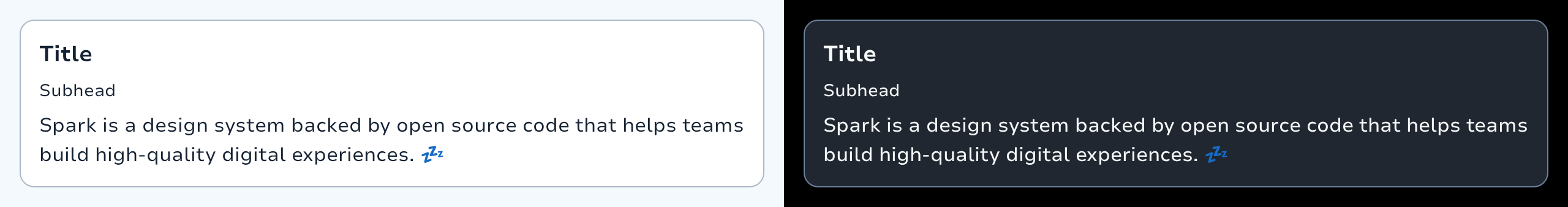
Flat Card

Flat cards provide subtle separation from the background. This has less emphasis than elevated or outlined cards.
Card.Flat {
    Text("This is a flat card with default styling.")
}Elevated Card

Elevated cards have a drop shadow, providing more separation from the background than filled cards, but less than outlined cards.
Card.Elevated {
    Text("This is an elevated card with a drop shadow.")
}Outlined Card
Outlined cards have a visual boundary around the container. This can provide greater emphasis than the other types.
Card.Outlined {
    Text("This is an outlined card with a border.")
}Highlight Flat Card

Highlight flat cards feature a colored banner at the top for additional emphasis.
Card.HighlightFlat(
    heading = { }
) {
    Text("Card with highlight banner")
}Highlight Elevated Card

Highlight elevated cards combine a colored top banner with a drop shadow for maximum emphasis.
Card.HighlightElevated(
    heading = { }
) {
    Text("Card with highlight banner and elevation")
}Interactive Cards
Cards can be made interactive by providing an onClick handler. Interactive cards respond to user input and can be hovered, clicked, focused, etc.
Card.Flat(
    onClick = { /* Handle click */ }
) {
    Text("Clickable card")
}Static cards may have interactive elements within them but are not actionable or interactive on their own.
States
Interactive cards support enabled and disabled states. When disabled, the card will not respond to user input and will appear visually disabled.
Card.Flat(
    onClick = { /* Handle click */ },
    enabled = false
) {
    Text("Disabled card")
}Customization
Content Padding
You can customize the content padding to adjust spacing within the card:
Card.Flat(
    contentPadding = PaddingValues(24.dp)
) {
    Text("Card with custom padding")
}Shapes
Cards use the medium shape from SparkTheme by default, but you can customize the shape:
Card.Flat(
    shape = SparkTheme.shapes.large
) {
    Text("Card with custom shape")
}Colors
For flat cards, you can customize the background color:
Card.Flat(
    colors = SparkTheme.colors.backgroundVariant
) {
    Text("Card with custom color")
}For outlined cards, you can customize the border color:
Card.Outlined(
    borderColor = SparkTheme.colors.outlineHigh
) {
    Text("Card with custom border color")
}
Content Examples
Cards can contain various types of content:
Text Content
Card.Elevated {
    Column {
        Text(
            text = "Card Title",
            style = SparkTheme.typography.headline2
        )
        Text("Card description text")
    }
}With Icons
Card.Elevated {
    Row {
        Icon(LeboncoinIcons.HeartOutline, contentDescription = null)
        Text("Card with icon")
    }
}With Buttons
Card.Elevated {
    Column {
        Text("Card Title")
        Text("Card description")
        ButtonFilled(
            text = "Action",
            onClick = { }
        )
    }
}Best Practices
Use cards to group related content and actions
Choose the appropriate variant based on the level of emphasis needed
Make cards interactive only when the entire card should be clickable
Ensure cards have sufficient padding for readability
Use elevated cards sparingly to maintain visual hierarchy
Consider accessibility when making cards interactive
Types
Represents the container and content colors used in a card in different states.
Represents the elevation for a card in different states.
Functions
Spark card.
Spark Elevated Card.