Package-level declarations

Chips help users quickly recognize an important information that has been entered by them, trigger actions, make selections, or filter content.

Most commonly chip contains an optional leadingIcon and the text.

Styles

The chip can have one of the ChipStyles:

Outlined

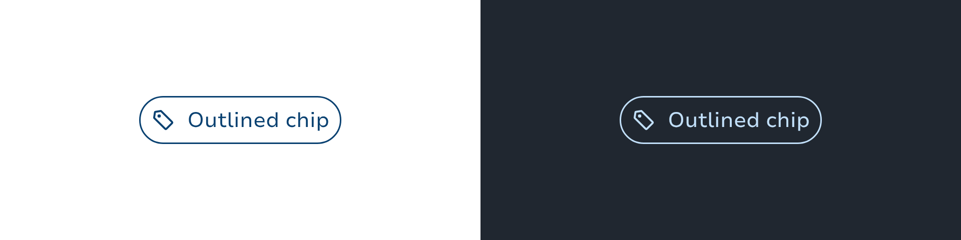
Outlined chips use a solid border stroke and no background.

Tinted

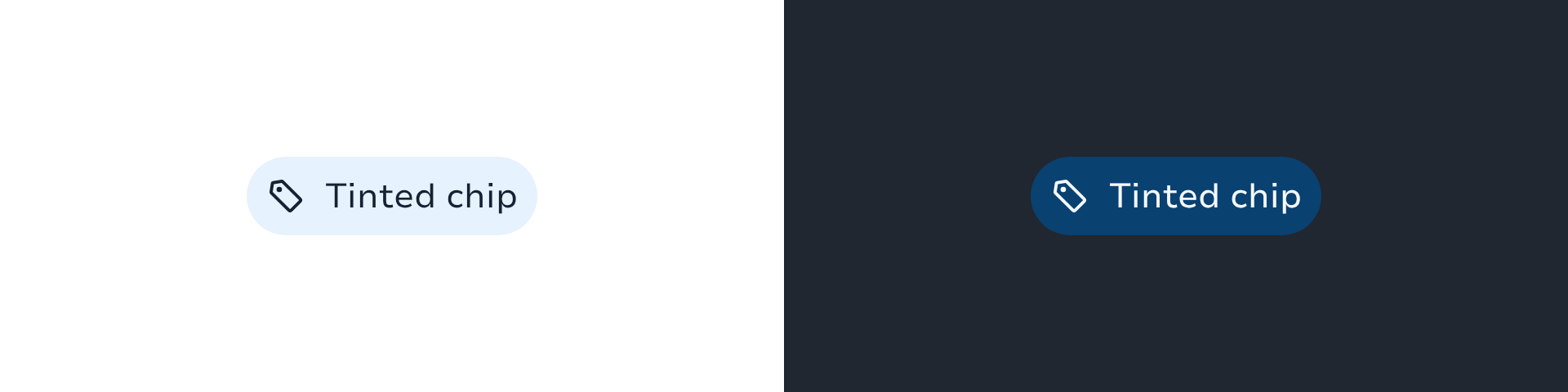
Tinted chips use one of the "containers" colors for a filled background.

Dashed

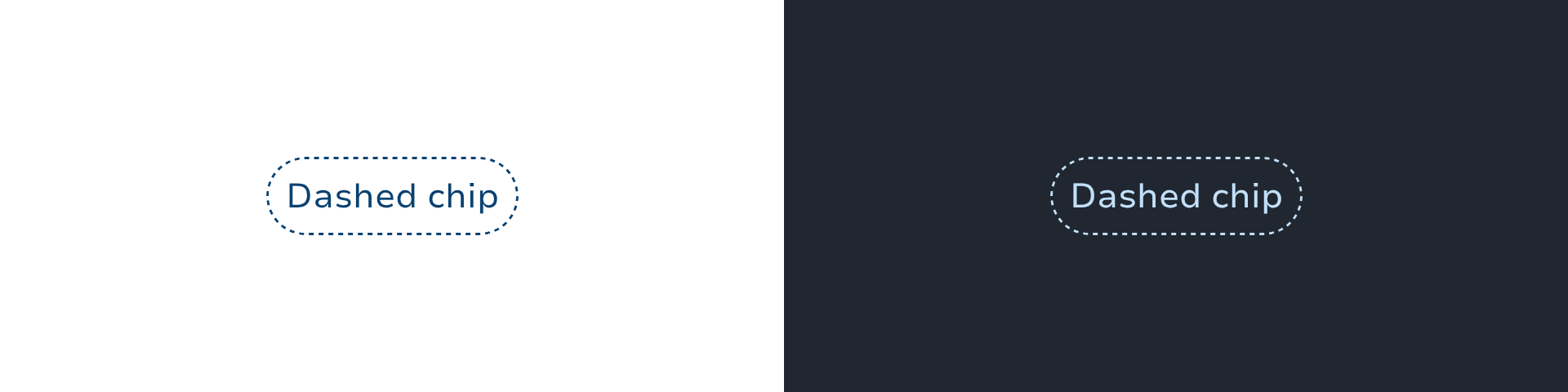
Dashed chips use a dashed border and no background.

The color is set using one of the ChipIntents:

  • Support (default color)

  • Accent

  • Main

  • Success

  • Alert

  • Danger

  • Info

  • Neutral

  • Surface

To draw a chip with an optional leading icon and text.

ChipOutlined(
text = "default chip",
leadingIcon = LeboncoinIcons.CalendarOutline,
onClick = {},
)

To pass a custom content:

ChipSelectable(
onClick = {},
) {
Text(text = "Animals")
Icon(
sparkIcon = LeboncoinIcons.ArrowHorizontalUp,
modifier = Modifier.size(12.dp),
contentDescription = null,
tint = LocalContentColor.current,
)
}

Handling selection

Chips support selection with the ChipSelectable Variant.

Single selection

You'll need to add the selectableGroup modifier to the parent container of the chips.

and specify the Role.RadioButton semantics for each chip to indicate that only one of the chip can be selected at a time.

fun Modifier.semantics {
this.role = Role.RadioButton
}
val filters by remember {
mutableStateOf(
persistentListOf("Fruit","Vegetable"),
)
}
var singleSelected by remember { mutableStateOf("Fruit") }
FlowRow(
horizontalArrangement = spacedBy(8.dp),
modifier = Modifier.selectableGroup()
) {
filters.forEach { filter ->
ChipSelectable(
modifier = Modifier.semantics {
role = Role.RadioButton
},
text = filter,
selected = singleSelected == filter,
onClick = { singleSelected = filter },
)
}
}

Multiple selection

val filters by remember {
mutableStateOf(
persistentListOf("Animal","Flower","Tree")
)
}
var selectedFilters by remember { mutableStateOf(listOf("Animal", "Tree")) }
FlowRow(
horizontalArrangement = spacedBy(8.dp),
) {
filters.forEach { filter ->
val selected = filter in selectedFilters
ChipSelectable(
text = filter.name,
selected = selected,
leadingIcon = if (selected) LeboncoinIcons.Check else null,
onClick = {
unionSelected = if (selected) {
selectedFilters - filter
} else {
selectedFilters + filter
}
},
)
}
}

Types

Link copied to clipboard

ChipIntent is used to define the intent of the chip.

Link copied to clipboard
object ChipTokens

Component tokens for chip components. Centralises all flag-driven token resolution so that chip composables read from a single source of truth instead of inlining the flag check at every call site. When the rebranding feature flag is eventually removed, only this file changes.

Functions

Link copied to clipboard
fun Chip(onClick: () -> Unit, modifier: Modifier = Modifier, onClose: () -> Unit? = null, onCloseLabel: String? = null, intent: ChipIntent = ChipIntent.Support, style: ChipStyles = ChipStyles.Outlined, enabled: Boolean = true, interactionSource: MutableInteractionSource = remember { MutableInteractionSource() }, leadingIcon: @Composable () -> Unit? = null, trailingIcon: @Composable () -> Unit? = null, content: @Composable RowScope.() -> Unit?)
fun Chip(onClick: () -> Unit, text: String?, modifier: Modifier = Modifier, onClose: () -> Unit? = null, onCloseLabel: String? = null, intent: ChipIntent = ChipIntent.Support, style: ChipStyles = ChipStyles.Outlined, enabled: Boolean = true, leadingIcon: SparkIcon? = null, contentDescription: String? = null, interactionSource: MutableInteractionSource = remember { MutableInteractionSource() })

Chips help users quickly recognize an important information that has been entered by them, trigger actions, make selections, or filter content.

Link copied to clipboard
fun ChipDashed(icon: SparkIcon, contentDescription: String, modifier: Modifier = Modifier, intent: ChipIntent = ChipIntent.Support, enabled: Boolean = true, interactionSource: MutableInteractionSource = remember { MutableInteractionSource() }, onClick: () -> Unit = {})
fun ChipDashed(modifier: Modifier = Modifier, intent: ChipIntent = ChipIntent.Support, enabled: Boolean = true, interactionSource: MutableInteractionSource = remember { MutableInteractionSource() }, onClick: () -> Unit = {}, leadingIcon: @Composable () -> Unit? = null, trailingIcon: @Composable () -> Unit? = null, content: @Composable RowScope.() -> Unit)

Outlined chip with dashed border.

fun ChipDashed(text: String, modifier: Modifier = Modifier, intent: ChipIntent = ChipIntent.Support, enabled: Boolean = true, leadingIcon: SparkIcon? = null, interactionSource: MutableInteractionSource = remember { MutableInteractionSource() }, onClick: () -> Unit = {})

Outlined chip with dashed border

Link copied to clipboard
fun ChipOutlined(icon: SparkIcon, contentDescription: String, modifier: Modifier = Modifier, intent: ChipIntent = ChipIntent.Support, enabled: Boolean = true, interactionSource: MutableInteractionSource = remember { MutableInteractionSource() }, onClick: () -> Unit = {})
fun ChipOutlined(text: String, modifier: Modifier = Modifier, intent: ChipIntent = ChipIntent.Support, enabled: Boolean = true, leadingIcon: SparkIcon? = null, interactionSource: MutableInteractionSource = remember { MutableInteractionSource() }, onClick: () -> Unit = {})
fun ChipOutlined(modifier: Modifier = Modifier, intent: ChipIntent = ChipIntent.Support, enabled: Boolean = true, interactionSource: MutableInteractionSource = remember { MutableInteractionSource() }, onClick: () -> Unit = {}, leadingIcon: @Composable () -> Unit? = null, trailingIcon: @Composable () -> Unit? = null, content: @Composable RowScope.() -> Unit)

A chip with no background but having a border

Link copied to clipboard
fun ChipSelectable(selected: Boolean, onClick: () -> Unit, modifier: Modifier = Modifier, onClose: () -> Unit? = null, onCloseLabel: String? = null, intent: ChipIntent = ChipIntent.Support, style: ChipStyles = ChipStyles.Outlined, enabled: Boolean = true, interactionSource: MutableInteractionSource = remember { MutableInteractionSource() }, leadingIcon: @Composable () -> Unit? = null, trailingIcon: @Composable () -> Unit? = null, content: @Composable RowScope.() -> Unit?)
fun ChipSelectable(selected: Boolean, onClick: () -> Unit, text: String?, modifier: Modifier = Modifier, onClose: () -> Unit? = null, onCloseLabel: String? = null, intent: ChipIntent = ChipIntent.Support, style: ChipStyles = ChipStyles.Outlined, enabled: Boolean = true, leadingIcon: SparkIcon? = null, contentDescription: String? = null, interactionSource: MutableInteractionSource = remember { MutableInteractionSource() })

Chips help users quickly recognize an important information that has been entered by them, trigger actions, make selections, or filter content.

Link copied to clipboard
fun ChipTinted(icon: SparkIcon, contentDescription: String, modifier: Modifier = Modifier, intent: ChipIntent = ChipIntent.Support, enabled: Boolean = true, interactionSource: MutableInteractionSource = remember { MutableInteractionSource() }, onClick: () -> Unit = {})
fun ChipTinted(text: String, modifier: Modifier = Modifier, intent: ChipIntent = ChipIntent.Support, enabled: Boolean = true, leadingIcon: SparkIcon? = null, interactionSource: MutableInteractionSource = remember { MutableInteractionSource() }, onClick: () -> Unit = {})
fun ChipTinted(modifier: Modifier = Modifier, intent: ChipIntent = ChipIntent.Support, enabled: Boolean = true, interactionSource: MutableInteractionSource = remember { MutableInteractionSource() }, onClick: () -> Unit = {}, leadingIcon: @Composable () -> Unit? = null, trailingIcon: @Composable () -> Unit? = null, content: @Composable RowScope.() -> Unit)

A chip with lighter background and no border