Package-level declarations
SegmentedGauge is a non-interactive visual indicator made up of colored segments. It shows a level or value along a scale (e.g., from "low" to "high"). The gauge is used to visually illustrate the quality of an abstract element (e.g., contact, pricing, rating, etc.). It has a limited granularity (between 3 and 5 colored cells) to help users instantly understand the value of the associated element.
When to Use
Display price level (e.g., fair or overpriced)
Indicate potential (e.g., to explore, moderate, high)
Show a score or rating
When you need to show a visual level or performance in a quick, simple way
When you want to compare several items on the same scale (e.g., products)
When the user doesn't need to interact (read-only data)
When the value is qualitative, not exact (e.g., "moderate", not "75%")
When Not to Use
If the data is precise or numeric (use a chart or numeric gauge instead)
If the user must interact (select, filter, or edit)
If color meaning isn't clear or consistent
If the gauge would be too small to read easily (dense mobile layouts, compact tables)
For evaluating an element based on human input (use the "rating" component instead)
When a bi-directional scale (center-out) is required
API Overview
SegmentedGauge (Five Segments)
@Composable
fun SegmentedGauge(
    modifier: Modifier = Modifier,
    size: GaugeSize = GaugeDefaults.Size,
    type: GaugeTypeFive? = null,
    customColor: Color = GaugeDefaults.Color,
    showIndicator: Boolean = true,
    description: @Composable FlowRowScope.() -> Unit,
)SegmentedGaugeShort (Three Segments)
@Composable
fun SegmentedGaugeShort(
    modifier: Modifier = Modifier,
    size: GaugeSize = GaugeDefaults.Size,
    type: GaugeTypeThree? = null,
    customColor: Color = GaugeDefaults.Color,
    showIndicator: Boolean = true,
    description: @Composable FlowRowScope.() -> Unit,
)Variants
Five-Segment Gauge Types
| Light Theme | Dark Theme |
|---|---|
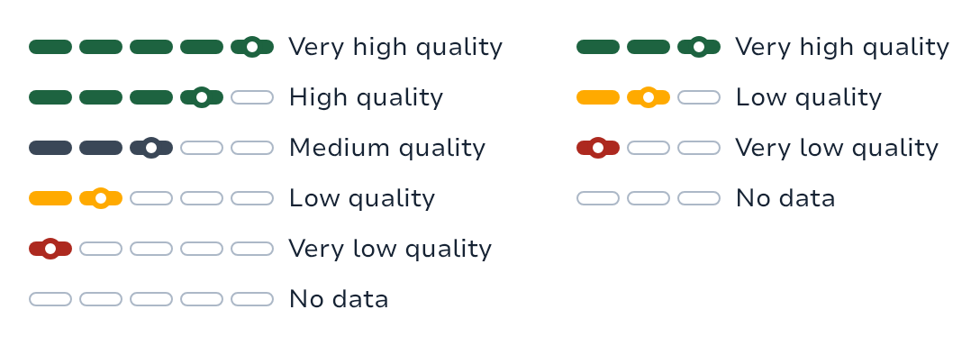 | 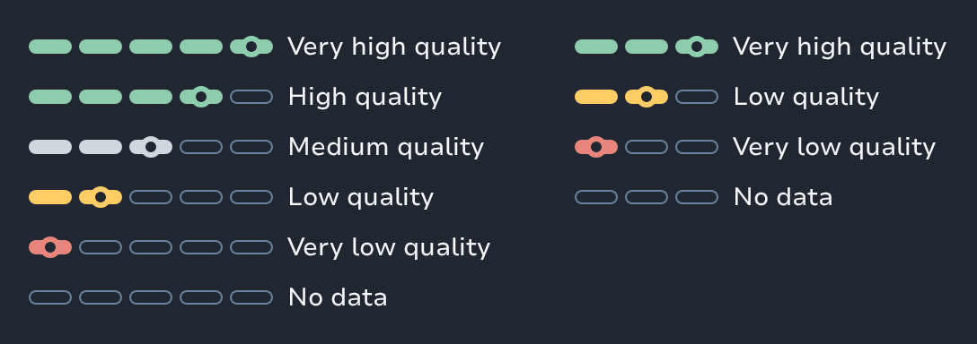 |
Sizes
| Light Theme | Dark Theme |
|---|---|
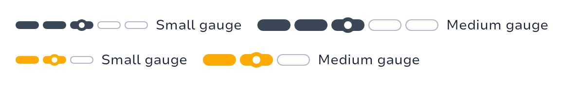 | 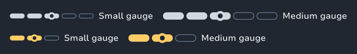 |
Custom Colors
| Light Theme | Dark Theme |
|---|---|
 |  |
Usage Examples
Basic Implementation
// Five-segment gauge for quality rating
SegmentedGauge(type = GaugeTypeFive.VeryHigh) { Text("Very high quality") }

// Three-segment gauge for potential indicator
SegmentedGaugeShort(type = GaugeTypeThree.Low) { Text("Low potential") }

// Custom colored gauge
SegmentedGauge(
    type = GaugeTypeFive.Medium,
    color = Color.Blue
) { Text("Medium custom color") }

// Different sizes
SegmentedGauge(
    size = GaugeSize.Small,
    type = GaugeTypeFive.High
) { Text("Small gauge") }Contact Purchase Score
@Composable
fun ContactPurchaseScore(score: Int) {
    // Scale: 1 (Potential to explore) → 3 (High potential)
    val gaugeType = when (score) {
        3 -> GaugeTypeThree.VeryHigh
        2 -> GaugeTypeThree.Low
        1 -> GaugeTypeThree.VeryLow
        else -> null
    }

    Row(
        verticalAlignment = Alignment.CenterVertically,
        horizontalArrangement = Arrangement.spacedBy(8.dp)
    ) {
        Text("Purchase Potential:")
        SegmentedGaugeShort(type = gaugeType) { Text("Potential of $score")
    }
}Accessibility
The SegmentedGauge component provides semantic color coding that conveys meaning through visual design. Always pair color with a textual label to ensure readability and accessibility. The component can receive focus for screen reader access.
Color Consistency: Maintain consistent color meanings (green = positive, yellow = warning, red = negative)
Text Labels: Always pair color with textual labels
Focus Support: Component can receive focus for screen reader accessibility
Color Contrast: Ensure sufficient contrast ratios are maintained
Types
Contains default values and design tokens for the SegmentedGauge component.
Defines the available types for five-segment gauges.
Defines the available types for three-segment gauges.
Functions
A five-segment read-only gauge used to represent qualitative levels (for example: Very low → Very high).
A compact, three-segment read-only gauge used to represent qualitative levels (for example: "Very low", "Low", "Very high").