Package-level declarations
Meter displays a numeric value as a circular progress ring with configurable content inside.
When to Use
Showing a KPI value or completion percentage at a glance
Dashboards, hero stats, or list items requiring compact progress indicators
Any measurable value on an arbitrary float range, not just percentages
Variants
| Variant | Size | Content |
|---|---|---|
Meter.Circular | Medium / Large / XLarge | Content inside the ring via CircularMeterContent |
Meter.CircularSmall | Small (24dp, fixed) | Value text rendered outside the ring |
| Circular | CircularSmall |
|---|---|
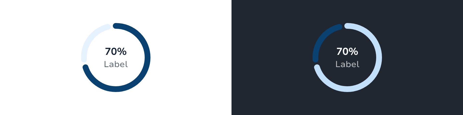 | 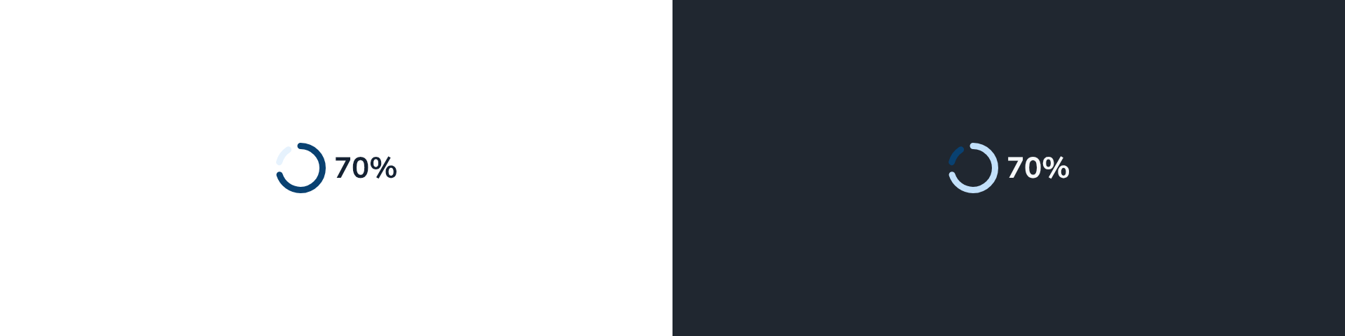 |
API
Meter.Circular
fun Meter.Circular(
    value: Float,
    content: CircularMeterContent,
    modifier: Modifier = Modifier,
    range: ClosedFloatingPointRange<Float> = MeterDefaults.Range,
    intent: MeterIntent = MeterDefaults.Intent,
    size: CircleMeterSize = MeterDefaults.Size,
    contentDescription: String? = null,
) {}| Parameter | Default | Notes |
|---|---|---|
value | — | Current value within range |
content | — | What to render inside the ring; see Content Types |
range | 0f..100f | Accepts any float range, e.g. 0f..200f for euros |
intent | Support | Color intent for indicator and track |
size | Large | Medium, Large, or XLarge |
suffix | null | Appended to the TalkBack state announcement, suppressing the default "xx percent". E.g. " euros" → "120 euros". null keeps the percentage fallback. |
Meter.CircularSmall
fun Meter.CircularSmall(
    value: Float,
    modifier: Modifier = Modifier,
    range: ClosedFloatingPointRange<Float> = MeterDefaults.Range,
    intent: MeterIntent = MeterDefaults.Intent,
) {}CircularSmall is a fixed 24dp ring. It renders the progress value as text outside the ring and exposes no content parameter. Use it in list items, table cells, or sticky bottom bars.
Content Types
Pass a CircularMeterContent instance as the content parameter of Meter.Circular.
| Type | Required fields | Notes |
|---|---|---|
Value | — | formatValue: (Float) -> String converts the raw value to a display string; defaults to "${it.toInt()}%" |
ValueLabel | label | Same formatValue as Value; label is the secondary string below the value |
Icon | icon, contentDescription | SparkIcon centred in the ring; tint inherits the intent colour; optional label below |
Image | contentDescription, model | Composable image centred in the ring |
Custom | content | Fully custom @Composable BoxScope.() -> Unit; attach semantics inside the content block |
| Value | ValueLabel | Icon | Image |
|---|---|---|---|
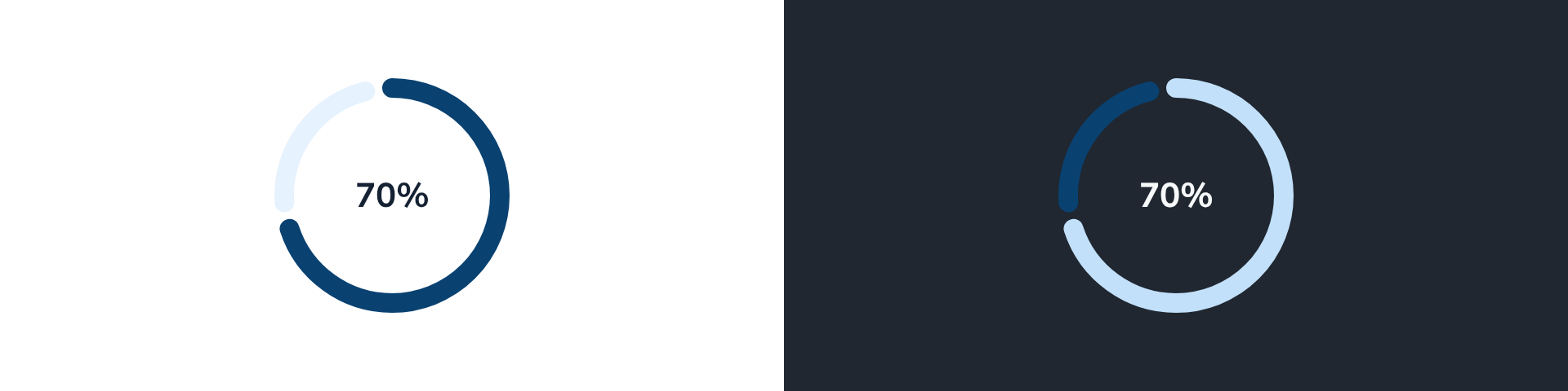 | 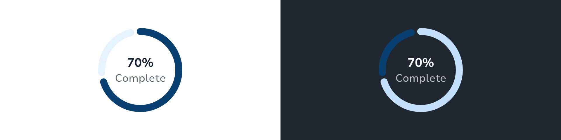 | 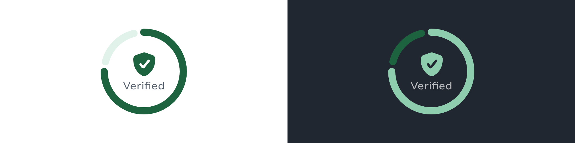 |  |
Custom.contentDescription feeds TalkBack directly — no text is derived automatically from arbitrary composable content. Supply it whenever your custom content carries meaning.
Sizes
Small is used internally by Meter.CircularSmall and is not available on Meter.Circular.
| Size | Diameter | Stroke | Icon slot | Typical context |
|---|---|---|---|---|
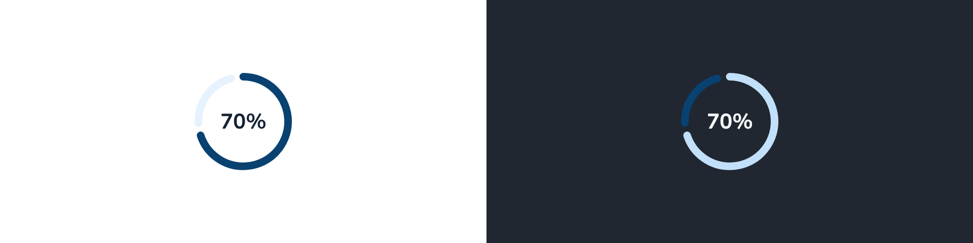
Medium | 64dp | 5dp | 24dp | KPI cards |
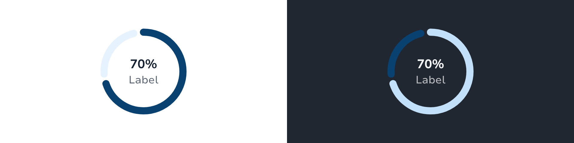
Large | 96dp | 8dp | 32dp | Dashboards or hero KPI (default) |
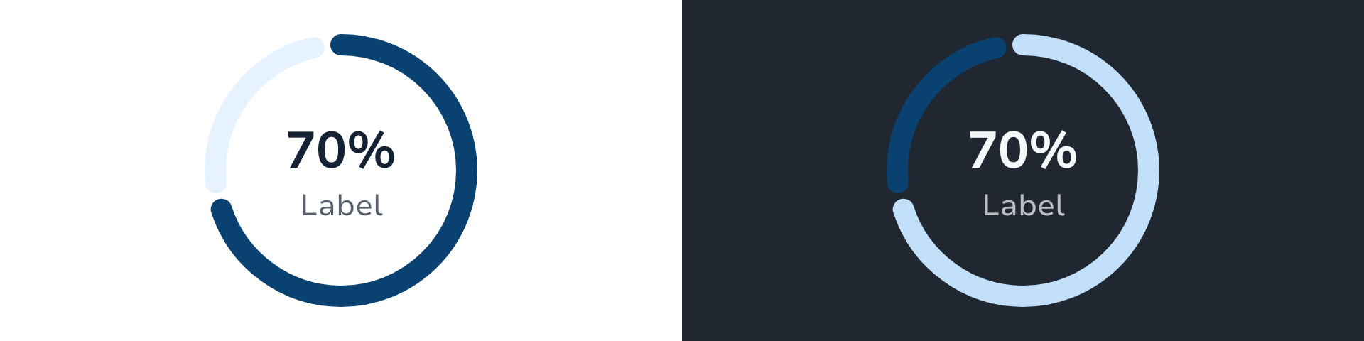
XLarge | 128dp | 10dp | 40dp | Large dashboards or tablets |
| Medium | Large | XLarge |
|---|---|---|
 |  |  |
Intents
Support (default), Main, Accent, Success, Alert, Danger, Info, Neutral.
The intent colour applies to both the progress arc and the icon tint when using CircularMeterContent.Icon.
Usage Examples
Basic value
Meter.Circular(
    value = 70f,
    content = CircularMeterContent.Value(),
)Value with label
Meter.Circular(
    value = 70f,
    content = CircularMeterContent.ValueLabel(label = "Complete"),
    size = CircleMeterSize.Large,
)Icon content
Meter.Circular(
    value = 3f,
    range = 0f..5f,
    content = CircularMeterContent.Icon(
        icon = SparkIcons.StarFill,
        contentDescription = "Rating: 3 out of 5",
        label = "Rating",
    ),
    intent = MeterIntent.Accent,
)Non-percentage range with accessible suffix
Meter.Circular(
    value = 120f,
    range = 0f..200f,
    content = CircularMeterContent.Value(formatValue = { "€${it.toInt()}" }),
    suffix = " euros",
    intent = MeterIntent.Success,
)
// TalkBack announces: "€120 euros" instead of "60 percent"Custom content
Meter.Circular(
    value = 42f,
    content = CircularMeterContent.Custom(
        contentDescription = "42 new messages",
    ) {
        Text(text = "42", style = SparkTheme.typography.display3)
    },
)CircularSmall
Meter.CircularSmall(
    value = 70f,
    intent = MeterIntent.Support,
)Accessibility
Meter.CircularexposesProgressBarRangeInfowith the raw value and range so switch access and other tools can use them. TalkBack announces "48 of 56" forvalue = 48f, range = 0f..56fwhen nosuffixis set.For
ValueandValueLabelcontent,stateDescriptionis derived automatically fromformatValueso TalkBack announces the formatted string rather than a computed percentage. This prevents doubled announcements (e.g. "89 percent 70") when the range is not 0–100.For
Icon,Image, andCustomcontent,stateDescriptionis only set whensuffixis provided; otherwise TalkBack falls back to its own "xx of yy" or "xx percent" computation.IconandImagecarry a mandatorycontentDescriptionfield used as the node's accessible label.Customcallers must attach their own semantics inside the content block.To override the node label, apply
Modifier.semantics { contentDescription = "…" }on the call site.Meter.CircularSmallmerges its children into a single semantics node.
Customising the state announcement with suffix
For Value/ValueLabel, TalkBack announces formatValue(value) + suffix. The suffix appends a unit to the derived string:
// TalkBack announces: "120 euros"
Meter.Circular(
    value = 120f,
    range = 0f..200f,
    content = CircularMeterContent.Value(formatValue = { "${it.toInt()}" }),
    suffix = " euros",
)

// TalkBack announces: "4.5 stars"
Meter.Circular(
    value = 4.5f,
    range = 0f..5f,
    content = CircularMeterContent.Value(formatValue = { it.toString() }),
    suffix = " stars",
)

// suffix = null → TalkBack announces "75%" (from formatValue default)
Meter.Circular(
    value = 75f,
    content = CircularMeterContent.Value(),
)Design Guidelines
Refer to the design guidelines and Figma specification for visual and spacing guidelines.
Choose
Mediumfor card-level KPIs,Largefor dashboard heroes, andXLargewhere layout space allows (typically tablets).Use
CircularSmallin dense lists or table cells where a full ring would dominate the row.Keep value text concise; truncation inside the ring degrades legibility at
Mediumsize.