Package-level declarations
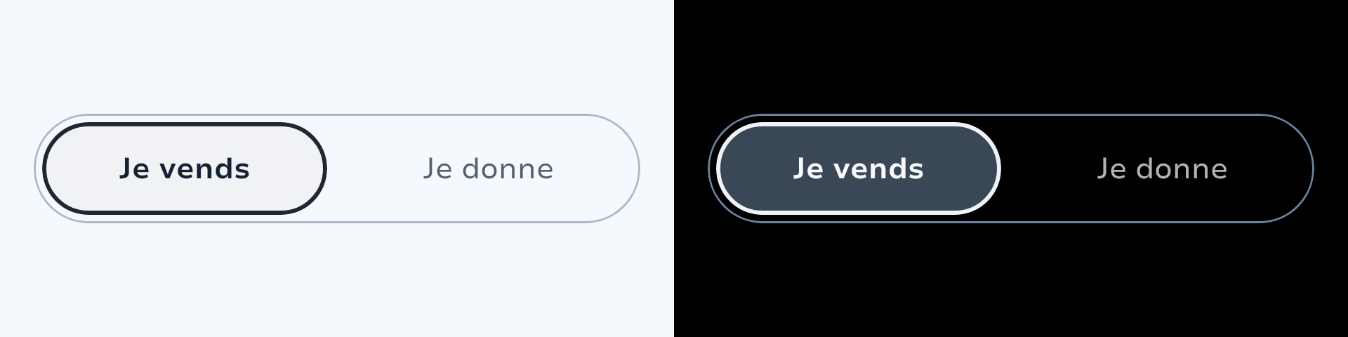
SegmentedControl lets users pick one option from a compact set, keeping all alternatives visible at once.
When to Use
Selecting a single option from 2–8 choices
Filtering or sorting content
Switching between views or modes
Variants
Two variants cover the full supported range of 2–8 segments:
| Variant | Segments | Layout |
|---|---|---|
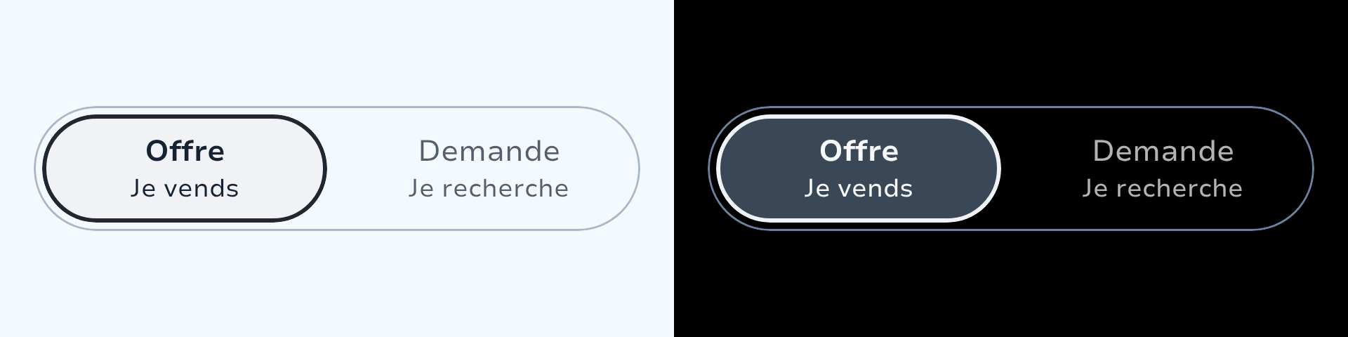
Horizontal | 2–5 | Single row, pill container |
Vertical | 4–8 | Two balanced rows, configurable shape |
| Horizontal | Vertical Rounded | Vertical Pill |
|---|---|---|
 |  |  |
State Management
State is fully caller-controlled. Pass selectedIndex into the component and wire each segment's onClick to update it. Each segment receives its own selected boolean and onClick lambda.
var selected by remember { mutableIntStateOf(0) }

SegmentedControl.Horizontal(selectedIndex = selected) {
    singleLine("Day",  selected = selected == 0, onClick = { selected = 0 })
    singleLine("Week", selected = selected == 1, onClick = { selected = 1 })
    singleLine("Month", selected = selected == 2, onClick = { selected = 2 })
}API
Horizontal
SegmentedControl.Horizontal(
    selectedIndex: Int,
    modifier: Modifier = Modifier,
    role: Role = Role.RadioButton,
    enabled: Boolean = true,
    indicatorContent: @Composable (selectedIndex: Int, enabled: Boolean) -> Unit = { _, enabled ->
        SegmentedControlDefaults.Indicator(shape = SegmentedControlShape.Pill.shape, enabled = enabled)
    },
    content: @Composable SegmentedControlScope.(SegmentedButtonItem) -> Unit,
)Vertical
SegmentedControl.Vertical(
    selectedIndex: Int,
    modifier: Modifier = Modifier,
    role: Role = Role.RadioButton,
    enabled: Boolean = true,
    shape: SegmentedControlShape = SegmentedControlShape.Rounded,
    indicatorContent: @Composable (selectedIndex: Int, enabled: Boolean) -> Unit = { _, enabled ->
        SegmentedControlDefaults.Indicator(shape = shape.shape, enabled = enabled)
    },
    content: @Composable SegmentedControlScope.(SegmentedButtonItem) -> Unit,
)Role
By default segments use Role.RadioButton (single-selection semantics). Use Role.Tab when the segmented control switches between entirely different layouts or content regions.
Shape
SegmentedControl.Vertical accepts a SegmentedControlShape that applies to both the segment touch targets and the animated indicator. Horizontal always uses Pill.
| Value | Shape |
|---|---|
SegmentedControlShape.Rounded | Large-radius rounded rectangle (default for Vertical) |
SegmentedControlShape.Pill | Fully rounded pill |
Segment Types
Segments are declared inside the content block via SegmentedControlScope. Every function call adds one segment in declaration order.
| Function | Content |
|---|---|
singleLine(text, selected, onClick) | Single line of text |
twoLine(title, subtitle, selected, onClick) | Title + caption |
icon(icon, contentDescription, selected, onClick) | Icon only |
iconText(icon, text, selected, iconOnTop, onClick) | Icon above label |
number(number, selected, onClick) | Integer label |
custom(selected, onClick, rippleColor, content) | Fully custom content |
Icon colour animates between SparkTheme.colors.support (unselected) and SparkTheme.colors.supportVariant (selected). Text weight and colour animate on all variants.
| Single Line | Two Line | Icon | Icon + Text | Number |
|---|---|---|---|---|
 |  |  | 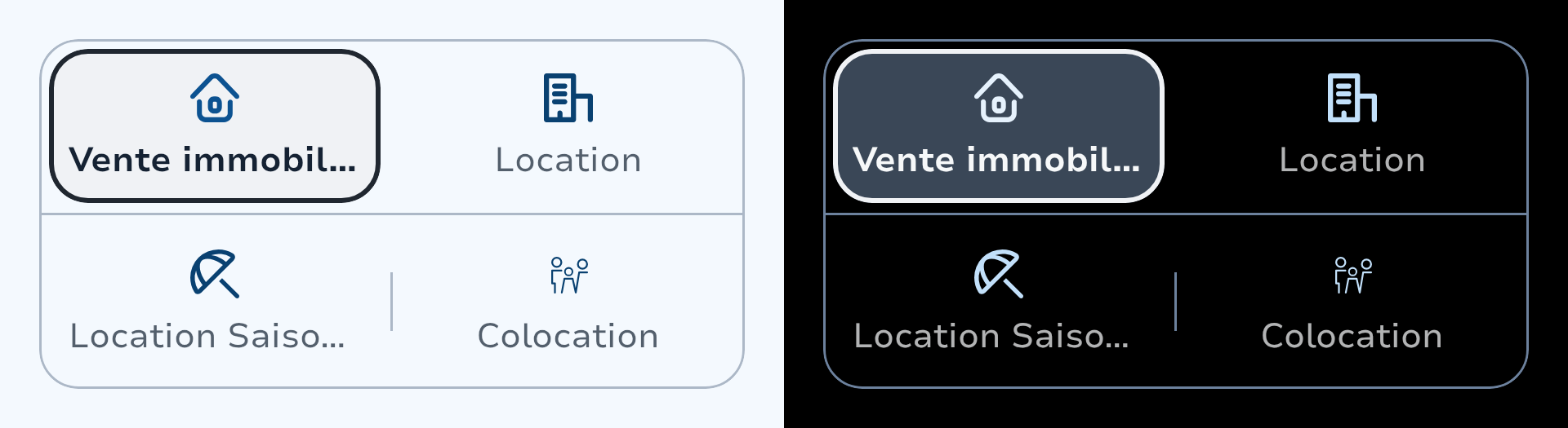 | 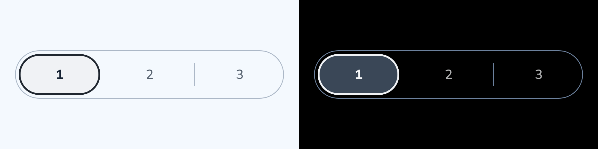 |
Usage Examples
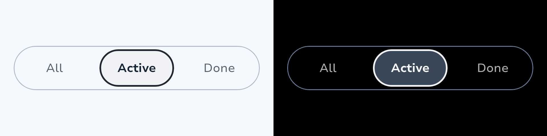
Basic — Horizontal
var selected by remember { mutableIntStateOf(0) }

SegmentedControl.Horizontal(selectedIndex = selected) {
    singleLine("All",       selected = selected == 0, onClick = { selected = 0 })
    singleLine("Active",    selected = selected == 1, onClick = { selected = 1 })
    singleLine("Completed", selected = selected == 2, onClick = { selected = 2 })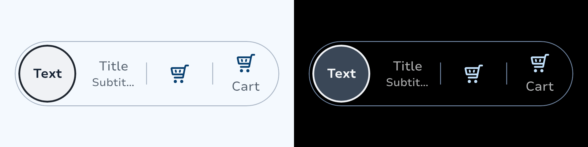
}Mixed Content Types
SegmentedControl.Horizontal(selectedIndex = selected) {
    singleLine("Text",    selected = selected == 0, onClick = { selected = 0 })
    twoLine("Title", "Subtitle", selected = selected == 1, onClick = { selected = 1 })
    icon(SparkIcons.Heart, contentDescription = "Favourites", selected = selected == 2, onClick = { selected = 2 })
    iconText(SparkIcons.Heart, "Saved", selected = selected == 3, iconOnTop = true, onClick = { selected = 3 })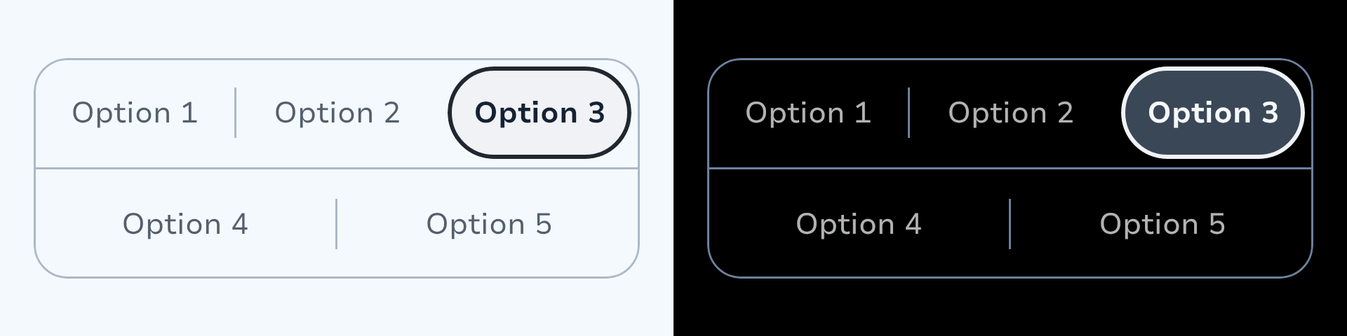
}Multi-Row — Vertical
var selected by remember { mutableIntStateOf(0) }

SegmentedControl.Vertical(
    selectedIndex = selected,
    shape = SegmentedControlShape.Rounded,
) {
    singleLine("Mon", selected = selected == 0, onClick = { selected = 0 })
    singleLine("Tue", selected = selected == 1, onClick = { selected = 1 })
    singleLine("Wed", selected = selected == 2, onClick = { selected = 2 })
    singleLine("Thu", selected = selected == 3, onClick = { selected = 3 })
    singleLine("Fri", selected = selected == 4, onClick = { selected = 4 })
}Customisation
Custom Indicator
Pass indicatorContent to replace the default pill. The lambda receives the current selectedIndex, so the indicator can reflect the active value — useful for colour-coded scales.
The default indicator (SegmentedControlDefaults.Indicator) draws a neutralContainer fill with a 2 dp outlineHigh border.
Custom Segments
Use custom when no built-in segment variant fits. The rippleColor parameter lets you match the ripple to a segment's own background.
Reusing Built-in Animations
Custom segments may need the same color and weight animations as standard segments. Two helpers in SegmentedControlDefaults expose these:
| Helper | Returns | Use case |
|---|---|---|
segmentLabelStyle(selected, enabled) | SegmentLabelStyle(color, textStyle) | Text colour + font weight animation |
segmentIconColor(selected, enabled) | State<Color> | Icon tint animation |
SegmentedControl.Horizontal(selectedIndex = selected) {
    custom(selected = selected == 0, onClick = { selected = 0 }) {
        val (labelColor, textStyle) = SegmentedControlDefaults.segmentLabelStyle(
            selected = selected == 0,
            enabled = true,
        )
        val iconColor by SegmentedControlDefaults.segmentIconColor(
            selected = selected == 0,
            enabled = true,
        )
        Row(verticalAlignment = Alignment.CenterVertically) {
            Icon(sparkIcon = myIcon, contentDescription = null, tint = iconColor)
            HorizontalSpacer(8.dp)
            Text(text = "Custom", color = labelColor, style = textStyle)
        }
    }
    singleLine("Other", selected = selected == 1, onClick = { selected = 1 })
}Energy Rating Scale (DPE)
A real-world example combining a custom indicator with custom segments. Both the indicator background and the segment label colour animate to match the selected energy class.
@Immutable
data class EnergyRatingData(val text: String, val color: Color, val contentColor: Color)

val ratings = listOf(
    EnergyRatingData("A", Color(0xFF009424), Color.White),
    EnergyRatingData("B", Color(0xFF3ACC31), Color.White),
    EnergyRatingData("C", Color(0xFFCDFD32), Color.Black),
    EnergyRatingData("D", Color(0xFFFBEA49), Color.Black),
    EnergyRatingData("E", Color(0xFFFCCB2F), Color.Black),
    EnergyRatingData("F", Color(0xFFFB9C34), Color.Black),
    EnergyRatingData("G", Color(0xFFFA1C1F), Color.White),
    EnergyRatingData("Vierge", Color.Unspecified, Color.Unspecified),
)

var selected by remember { mutableIntStateOf(7) }

SegmentedControl.Vertical(
    selectedIndex = selected,
    shape = SegmentedControlShape.Pill,
    indicatorContent = { selectedIndex ->
        val data = ratings[selectedIndex]
        val transition = updateTransition(data, label = "indicator")
        val background by transition.animateColor(label = "bg") { d ->
            if (d.color.isSpecified) d.color else SparkTheme.colors.neutralContainer
        }
        val borderColor by transition.animateColor(label = "border") { d ->
            if (d.color.isSpecified) SparkTheme.colors.outlineHigh.copy(alpha = 0f)
            else SparkTheme.colors.outlineHigh
        }
        val borderSize by transition.animateDp(label = "borderSize") { d ->
            if (d.color.isSpecified) 0.dp else 2.dp
        }
        Box(
            modifier = Modifier
                .fillMaxSize()
                .padding(4.dp)
                .clip(SegmentedControlShape.Pill.shape)
                .border(borderSize, borderColor, SegmentedControlShape.Pill.shape)
                .drawBehind { drawRect(background) },
        )
    },
) {
    ratings.forEachIndexed { index, data ->
        if (data.color.isSpecified) {
            // Custom segment: colour-coded label that adopts the rating's content colour
            custom(
                selected = selected == index,
                onClick = { selected = index },
                rippleColor = data.color,
            ) {
                val transition = updateTransition(selected == index, label = "label")
                val labelColor by transition.animateColor(label = "labelColor") {
                    if (it) data.contentColor else SparkTheme.colors.onSurface.dim1
                }
                val progress by transition.animateFloat(label = "progress") { if (it) 1f else 0f }
                Text(
                    text = data.text,
                    color = labelColor,
                    style = lerp(SparkTheme.typography.body2, SparkTheme.typography.body2.highlight, progress),
                )
            }
        } else {
            singleLine(data.text, selected = selected == index, onClick = { selected = index })
        }
    }
}Accessibility
Each segment defaults to
Role.RadioButtonsemantics; passRole.Tabwhen switching content regions. The container usesselectableGroup.icon()requires a mandatorycontentDescriptionparameter. Theselectablemodifier merges descendant semantics, so this label is what TalkBack announces for the segment.iconText()uses theTextchild as its merged accessible label; the icon is decorative.custom()callers must ensure their content provides semantic text (viaTextor acontentDescription).Minimum touch target: 48 dp.
enabled = falsesuppresses all input and ripple; TalkBack announces each segment as "Disabled".
Example — Icon-only segments
var selected by remember { mutableIntStateOf(0) }

SegmentedControl.Horizontal(selectedIndex = selected) {
    icon(
        icon = LeboncoinIcons.List,
        contentDescription = "List view",
        selected = selected == 0,
        onClick = { selected = 0 },
    )
    icon(
        icon = LeboncoinIcons.Map,
        contentDescription = "Map view",
        selected = selected == 1,
        onClick = { selected = 1 },
    )
}
// TalkBack reads: "List view, Selected, Radio button, 1 of 2"Tabs vs. radio buttons
Use role = Role.Tab when the segmented control drives a content region. This changes the TalkBack announcement from "Radio button, 1 of 3" to "Tab, 1 of 3".
Design Guidelines
Refer to the official design specifications for visual and interaction guidelines.
Use short, explicit labels; keep content homogeneous across segments.
Avoid more than 8 segments — prefer a Dropdown for larger sets.
Do not use for multiple selection.
Types
Marker interface returned by every SegmentedControlScope segment function.
Single-selection segmented control for choosing one option from a compact set.
Default values and constants for SegmentedControl.
DSL scope for declaring segments inside a SegmentedControl content block.
Shape options for the SegmentedControl.Vertical indicator and segment touch targets.
Default values and constants for SegmentedControl.
Animated colour and text style for segment labels.