Package-level declarations
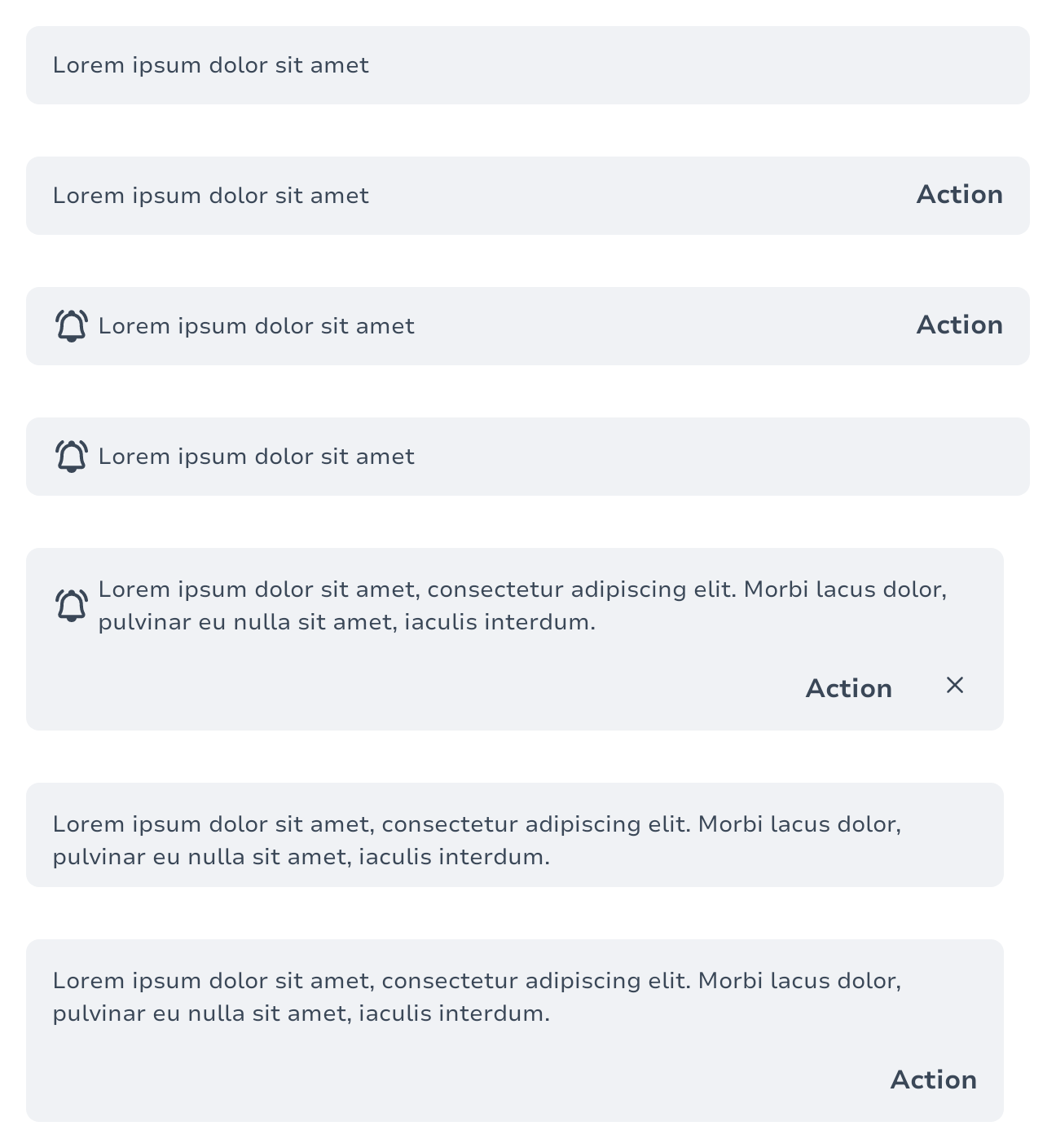
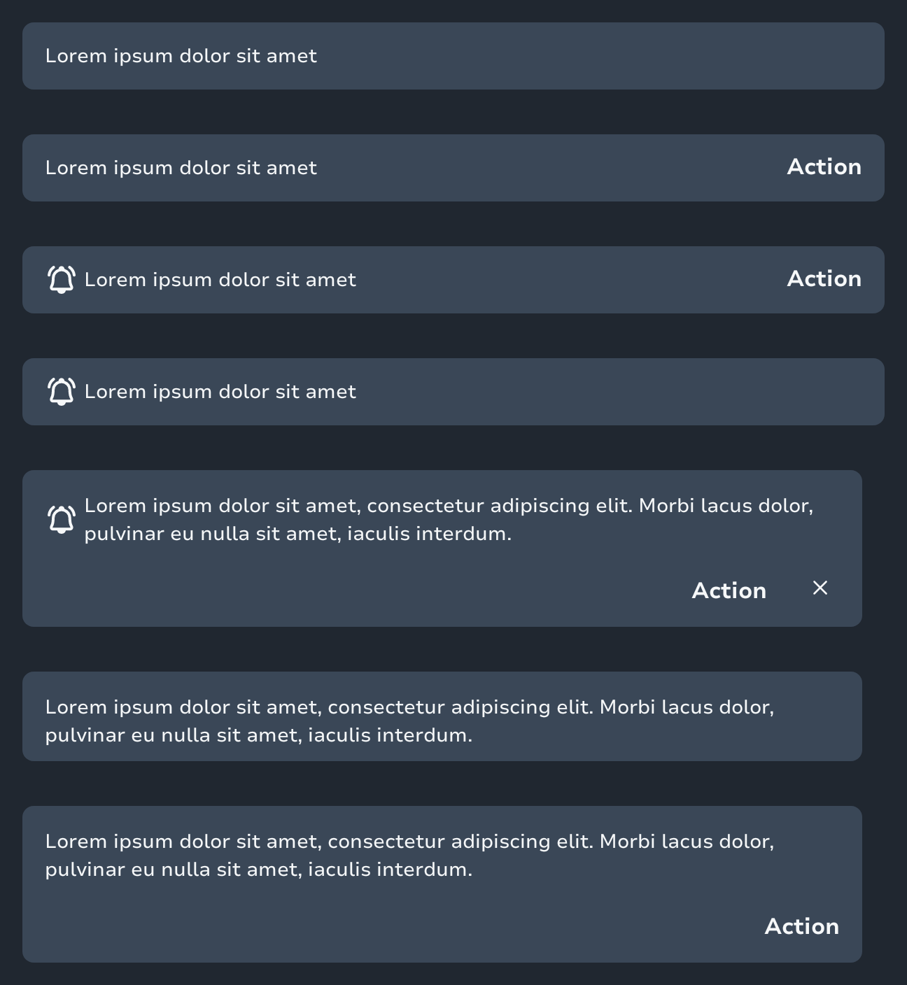
Snackbars inform users of a process that an app has performed or will perform They appear temporarily, towards the bottom of the screen. They should not interrupt the user experience, and they don’t require user input to disappear. Only one snackbar may be displayed at a time.
| Light | Dark |
|---|---|
 |  |
Basic Usage
The minimal usage of the component requires a message content:
Snackbar {
    Text("Your changes have been saved")
}Using with SnackbarHost
To display snackbars in your app, use them with a SnackbarHost:
private val snackbarHostState = remember { SnackbarHostState() }

LaunchedEffect(conversationsState) {
    if (shouldShowSnackbar) {
        snackbarHostState.showSnackbar(
            message = "Message",
            duration = SnackbarDuration.Short)
    }
}
Scaffold(
    snackbarHost = {
        SnackbarHost(hostState = snackbarHostState)
    },
) { innerPadding ->
    // Content
}Custom Icon
You can override the default intent icon by providing a custom icon parameter. When provided, the custom icon is displayed; otherwise, the snackbar falls back to the intent's default icon.
Snackbar(
    intent = SnackbarIntent.Success,
    icon = LeboncoinIcons.FlashlightFill,
) {
    Text("Custom icon snackbar")
}Title
An optional title parameter displays a title above the message content.
Snackbar(
    intent = SnackbarIntent.Alert,
    title = "Warning",
) {
    Text("Please review your changes before proceeding")
}Title with Custom Icon
You can combine both title and icon parameters:
Snackbar(
    intent = SnackbarIntent.Info,
    title = "Information",
    icon = LeboncoinIcons.FlashlightFill,
) {
    Text("This is an informational message with a custom icon")
}With Action
Snackbars can include a single action button:
Snackbar(
    intent = SnackbarIntent.Success,
    actionLabel = "Undo",
    onActionClick = { /* Handle action */ },
) {
    Text("Item deleted")
}With Dismiss Action
Enable a dismiss icon to allow users to manually close the snackbar:
Snackbar(
    intent = SnackbarIntent.Info,
    onDismissClick = { /* Handle dismiss */ },
) {
    Text("This snackbar can be dismissed")
}Types
State of the SnackbarHost, which controls the queue and the current Snackbar being shown inside the SnackbarHost.
SnackbarIntent is used to define the visual style and semantic meaning of a Snackbar. Each intent corresponds to a specific color palette from the Spark theme.
SnackbarVisuals interface that defines the visuals for a Snackbar.
Functions
Snackbars provide brief messages about app processes at the bottom of the screen.
Snackbars inform users of a process that an app has performed or will perform. They appear temporarily, towards the bottom of the screen. They shouldn’t interrupt the user experience, and they don’t require user input to disappear.
Host for Snackbars to be used in com.adevinta.spark.components.scaffold.Scaffold to properly show, hide and dismiss items based on Material specification and the hostState.