Package-level declarations
Dropdowns
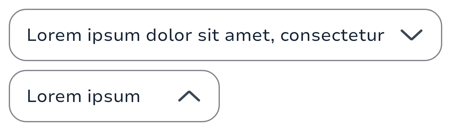
Dropdown allow users to select an option from a dropdown.
They typically appear in forms and dialogs. Dropdown is an interactive element that allows users to select an option from a list of choices presented in a collapsible menu. It saves space on the interface by concealing the options until the user interacts with the component.
| Textfield | Items & Groups |
 |
 |
The minimal usage of the component is :
The value of your TextField
The callback when the user exit the dismiss the dropdown without selecting a value.
A value to indicate if the dropdown should be shown or not.
A value
private val options = listOf("Option 1", "Option 2", "Option 3", "Option 4", "Option 5")
private var expanded by remember { mutableStateOf(false) }
private var selectedOptionText by remember { mutableStateOf(options[0]) }
Dropdown(
    value = selectedOptionsText,
    label = "label",
    onDismissRequest = {
        expanded = false
    },
    expanded = expanded,
    onExpandedChange = {
        expanded = !expanded
    },
) {
    options.forEach { selectionOption ->
        DropdownMenuItem(
            onClick = {
                selectedOptionText = selectionOption
                expanded = false
            },
        ) {
            Text(text = selectionOption)
        }
    }
}Multi selection
Like single selection, the selection system is handled by the developer. It enables you to have a multi selection dropdown logics that don't force you into using a specific model but your own.
Here's an example of a multi selection dropdown that you could use in your project:
// Your data source from your state model
private val DropdownStubData = persistentListOf(
    "To Kill a Mockingbird", "War and Peace", "The Idiot",
    "A Picture of Dorian Gray", "1984", "Pride and Prejudice",
)
private val multiSelectionFilter by remember { mutableStateOf(DropdownStubData) }

private var selectedItems by remember {
    mutableStateOf(listOf("To Kill a Mockingbird", "War and Peace"))
}
private val multiSelectedValues by remember(selectedItems.size) {
    derivedStateOf {
        val suffix = if (selectedItems.size > 1) ", +${selectedItems.size - 1}" else ""
        selectedItems.firstOrNull().orEmpty() + suffix
    }
}

SelectTextField(
    value = multiSelectedValues,
    // ...
) {
    multiSelectionFilter.forEach { book ->
        // This should be part of your model otherwise it's a huge work that done on
        // each items but we're simplifying things since it's an example here.
        val isSelected = book in selectedItems
        DropdownMenuItem(
            text = {
                Text(
                    text = book,
                    style = if (isSelected) {
                        SparkTheme.typography.body1.highlight
                    } else {
                        SparkTheme.typography.body1
                    },
                )
            },
            onClick = {
                selectedItems = if (book in selectedItems) {
                    selectedItems - book
                } else {
                    selectedItems + book
                }
                // Here we want to have the dropdown to stay expanded when we multiSelect but
                // you could use the line below if in the case you want to have the same behaviour
                // as the single selection.
                // expanded = false
            },
        )
    }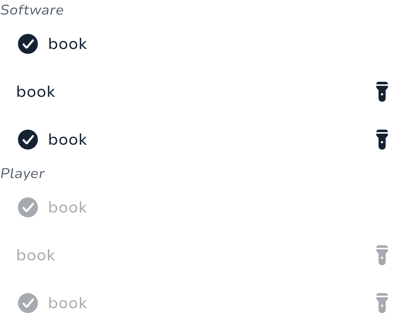
}Item groups
Dropdowns items can be grouped, you'll need to provide a label on it though. You can sort them like you want and the logic to show or not the group on sort is up to you.
Here's an example of a grouped dropdown that you could use in your project:
private val singleSelectionFilter by remember { mutableStateOf(DropdownStubData) }

private var singleSelected by remember { mutableStateOf("") }

Dropdown(
    value = singleSelected,
    // ...
) {
    singleSelectionFilter.forEach { (groupName, books) ->
        DropdownMenuGroupItem(
            title = { Text(groupName) }, // You can customize the style of the label here
        ) {
            books.forEach { book ->
                DropdownMenuItem(
                    text = { Text(book) },
                    onClick = {
                        singleSelected = book
                        expanded = false
                    },
                )
            }
        }
    }
}MultilineTextFields
MultilineTextFields allow users to enter text into a UI. They typically appear in forms and dialogs. The multiline variant can show a character counter and a clear value icon button.
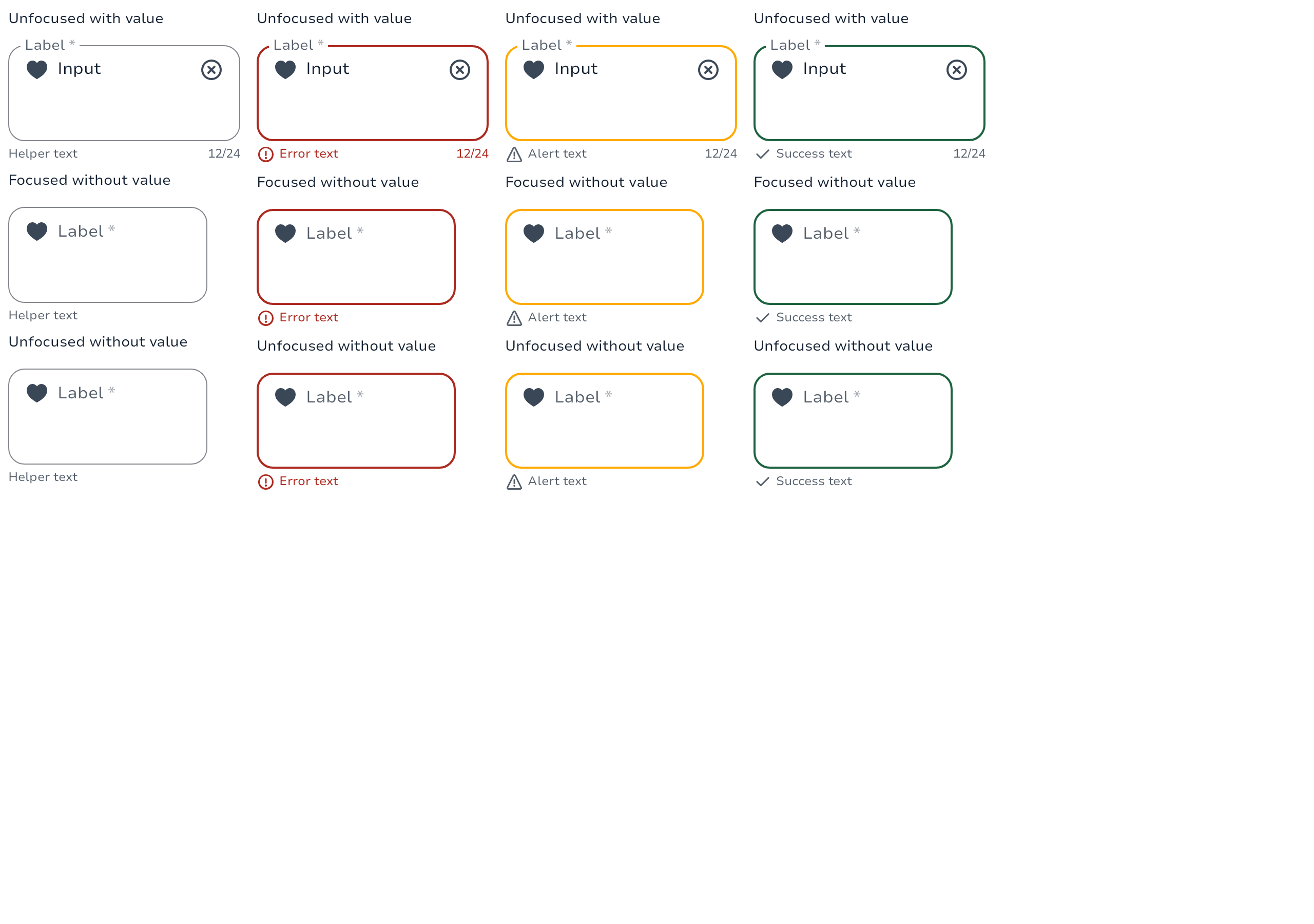
The minimal usage of the component is the value of your TextField and the callback to be called when the user type a new character but you can configure your TextField much more.
MultilineTextField(
    value = "Input",
    label = { Text("Label") },
    placeholder = { Text("Placeholder") },
    leadingIcon = {
        Icon(
            imageVector = Icons.Filled.ArrowDropDown,
            contentDescription = null
        )
    },
    onValueChange = { newValue -> }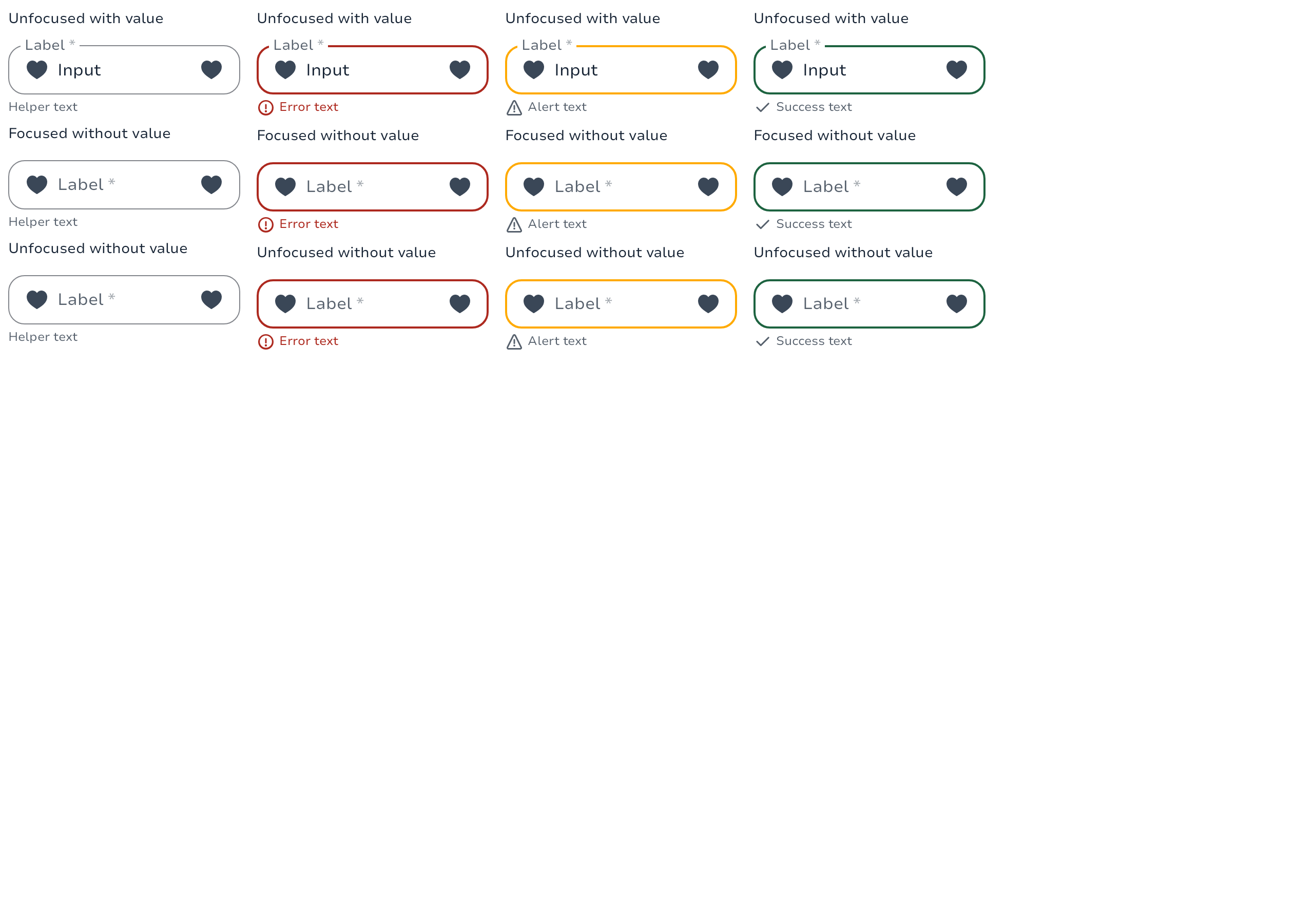
)Prefix/Suffix
MultilineTextField(
    value = "Input",
    label = { Text("Label") },
    placeholder = { Text("Placeholder") },
    leadingIcon = {
        // Prefix
        Text("Prefix", modifier = Modifier.padding(start = 16.dp))
    },
    leadingIcon = {
        // Suffix
        Text("Suffix", modifier = Modifier.padding(end = 16.dp))
    },
    onValueChange = { newValue -> }
)Textfields
Textfields allow users to enter text into a UI. They typically appear in forms and dialogs.
The minimal usage of the component is the value of your TextField and the callback to be called when the user type a new character but you can configure your TextField much more.
TextField(
    value = "Input",
    label = { Text("Label") },
    placeholder = { Text("Placeholder") },
    leadingContent = {
        Icon(
            imageVector = Icons.Filled.ArrowDropDown,
            contentDescription = null
        )
    },
    onValueChange = { newValue -> }
)Prefix/Suffix
TextField(
    value = "Input",
    label = { Text("Label") },
    placeholder = { Text("Placeholder") },
    leadingContent = {
        // Prefix
        Text("Prefix", modifier = Modifier.padding(start = 16.dp))
    },
    trailingContent = {
        // Suffix
        Text("Suffix", modifier = Modifier.padding(end = 16.dp))
    },
    onValueChange = { newValue -> }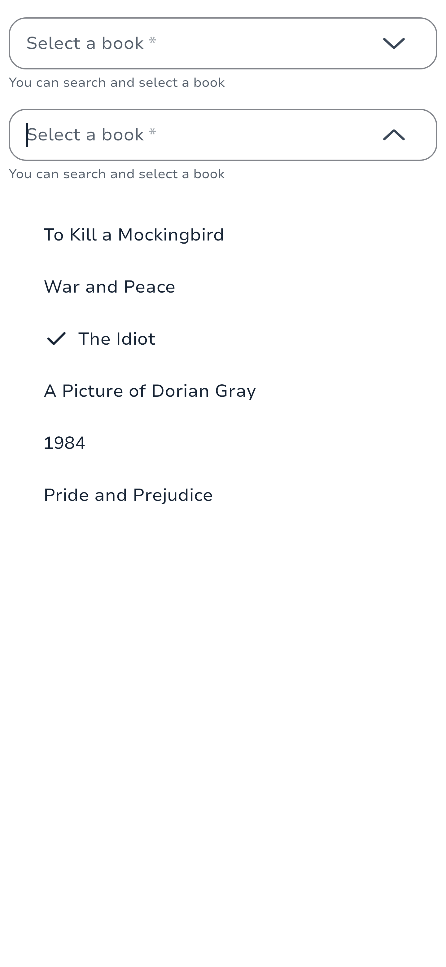
)ComboBox
ComboBox combines a text field with a dropdown menu, providing a searchable interface for selecting options. It's particularly useful when users need to select from a large list of options while having the ability to search or filter the choices.
They typically appear in forms and dialogs where users need to search through a large set of options.
| Single Choice | Multi Choice |
 |
 |
The minimal usage of the component is:
private val options = listOf("Option 1", "Option 2", "Option 3", "Option 4", "Option 5")
private var expanded by remember { mutableStateOf(false) }
private val state = rememberTextFieldState()

SingleChoiceComboBox(
    state = state,
    expanded = expanded,
    onExpandedChange = { expanded = it },
    onDismissRequest = { expanded = false },
    label = "Select an option",
) {
    options.forEach { option ->
        DropdownMenuItem(
            text = { Text(option) },
            selected = false,
            onClick = { expanded = false }
        )
    }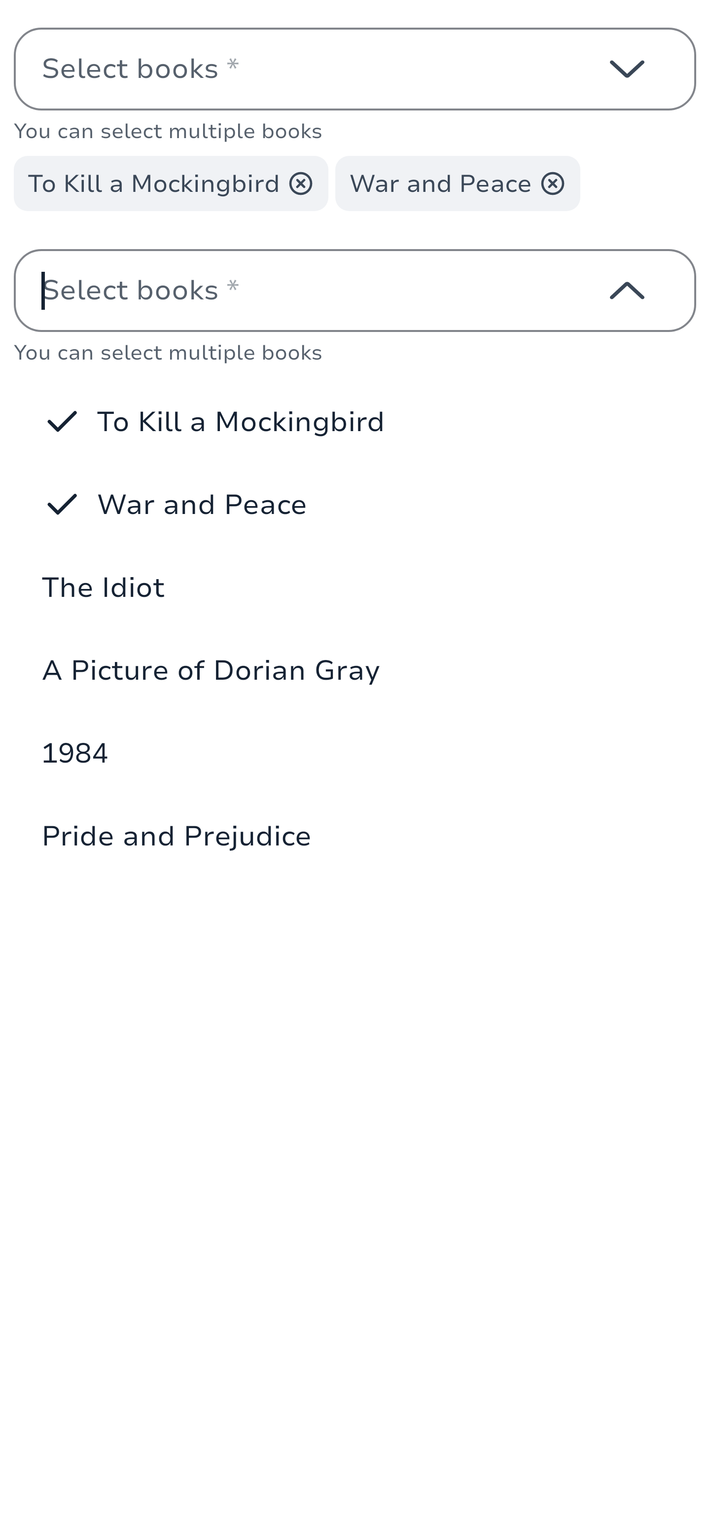
}Multi selection
The multi-selection ComboBox allows users to select multiple options, with selected choices displayed as chips below the text field. The selection system is handled by the developer, enabling custom multi-selection logic.
Here's an example of a multi-selection ComboBox:
// Your data source from your state model
private val ComboBoxStubData = persistentListOf(
    "To Kill a Mockingbird", "War and Peace", "The Idiot",
    "A Picture of Dorian Gray", "1984", "Pride and Prejudice",
)

private var selectedChoices by remember {
    mutableStateOf(persistentListOf(
        SelectedChoice("1", "To Kill a Mockingbird"),
        SelectedChoice("2", "War and Peace")
    ))
}

MultiChoiceComboBox(
    state = rememberTextFieldState(),
    expanded = expanded,
    onExpandedChange = { expanded = it },
    onDismissRequest = { expanded = false },
    selectedChoices = selectedChoices,
    onSelectedClick = { id ->
        selectedChoices = selectedChoices.filter { it.id != id }.toPersistentList()
    },
    label = "Select books",
) {
    ComboBoxStubData.forEachIndexed { index, book ->
        DropdownMenuItem(
            text = { Text(book) },
            selected = selectedChoices.any { it.label == book },
            onClick = {
                val choice = SelectedChoice(index.toString(), book)
                selectedChoices = if (selectedChoices.any { it.id == choice.id }) {
                    selectedChoices.filter { it.id != choice.id }.toPersistentList()
                } else {
                    selectedChoices.add(choice)
                }
            }
        )
    }
}Filtering
ComboBox supports filtering through the text field input. Here's an example of implementing filtering:
private val allOptions = listOf("Option 1", "Option 2", "Option 3", "Option 4", "Option 5")
private var expanded by remember { mutableStateOf(false) }
private val state = rememberTextFieldState()
private val filteredOptions = remember(state.text) {
    allOptions.filter { it.contains(state.text, ignoreCase = true) }
}

SingleChoiceComboBox(
    state = state,
    expanded = expanded,
    onExpandedChange = { expanded = it },
    onDismissRequest = { expanded = false },
    label = "Search and select",
) {
    if (filteredOptions.isEmpty()) {
        DropdownMenuItem(
            text = { Text("No matches found") },
            onClick = { }
        )
    } else {
        filteredOptions.forEach { option ->
            DropdownMenuItem(
                text = { Text(option) },
                selected = false,
                onClick = { expanded = false }
            )
        }
    }
}Item groups
Like Dropdowns, ComboBox items can be grouped. You can provide a label for each group and implement your own sorting logic.
Here's an example of a grouped ComboBox:
private val groupedOptions = mapOf(
    "Fiction" to listOf("To Kill a Mockingbird", "War and Peace", "The Idiot"),
    "Classics" to listOf("A Picture of Dorian Gray", "1984", "Pride and Prejudice")
)

SingleChoiceComboBox(
    state = state,
    expanded = expanded,
    onExpandedChange = { expanded = it },
    onDismissRequest = { expanded = false },
    label = "Select a book",
) {
    groupedOptions.forEach { (groupName, books) ->
        DropdownMenuGroupItem(
            title = { Text(groupName) }
        ) {
            books.forEach { book ->
                DropdownMenuItem(
                    text = { Text(book) },
                    selected = false,
                    onClick = { expanded = false }
                )
            }
        }
    }
}Usage
ComboBoxes are used when:
Users need to select from a large list of options
Search or filtering capabilities are required
The list of options is dynamic or frequently updated
Space is limited and a full dropdown list would be too large
Types
Single Choice ComboBox
A ComboBox that allows users to select a single option from the dropdown list.
@Composable
fun SingleChoiceComboBox(
    state: TextFieldState,
    expanded: Boolean,
    onExpandedChange: (Boolean) -> Unit,
    onDismissRequest: () -> Unit,
    modifier: Modifier = Modifier,
    enabled: Boolean = true,
    required: Boolean = false,
    label: String? = null,
    placeholder: String? = null,
    helper: String? = null,
    leadingContent: @Composable (AddonScope.() -> Unit)? = null,
    status: FormFieldStatus? = null,
    statusMessage: String? = null,
    inputTransformation: InputTransformation? = null,
    keyboardOptions: KeyboardOptions = KeyboardOptions.Default,
    onKeyboardAction: KeyboardActionHandler? = null,
    lineLimits: TextFieldLineLimits = TextFieldLineLimits.Default,
    onTextLayout: (Density.(getResult: () -> TextLayoutResult?) -> Unit)? = null,
    interactionSource: MutableInteractionSource? = null,
    outputTransformation: OutputTransformation? = null,
    scrollState: ScrollState = rememberScrollState(),
    dropdownContent: @Composable SingleChoiceDropdownItemColumnScope.() -> Unit,
)Multi Choice ComboBox
A ComboBox that allows users to select multiple options from the dropdown list. Selected choices are displayed as chips below the text field.
@Composable
fun MultiChoiceComboBox(
    state: TextFieldState,
    expanded: Boolean,
    onExpandedChange: (Boolean) -> Unit,
    onDismissRequest: () -> Unit,
    selectedChoices: ImmutableList<SelectedChoice>,
    onSelectedClick: (String) -> Unit,
    modifier: Modifier = Modifier,
    enabled: Boolean = true,
    required: Boolean = false,
    label: String? = null,
    placeholder: String? = null,
    helper: String? = null,
    leadingContent: @Composable (AddonScope.() -> Unit)? = null,
    status: FormFieldStatus? = null,
    statusMessage: String? = null,
    inputTransformation: InputTransformation? = null,
    keyboardOptions: KeyboardOptions = KeyboardOptions.Default,
    onKeyboardAction: KeyboardActionHandler? = null,
    lineLimits: TextFieldLineLimits = TextFieldLineLimits.Default,
    onTextLayout: (Density.(getResult: () -> TextLayoutResult?) -> Unit)? = null,
    interactionSource: MutableInteractionSource? = null,
    outputTransformation: OutputTransformation? = null,
    scrollState: ScrollState = rememberScrollState(),
    dropdownContent: @Composable MultiChoiceDropdownItemColumnScope.() -> Unit,
)Examples
Basic Single Choice ComboBox
@Composable
fun BasicSingleChoiceComboBox() {
    val state = rememberTextFieldState()
    var expanded by remember { mutableStateOf(false) }

    SingleChoiceComboBox(
        state = state,
        expanded = expanded,
        onExpandedChange = { expanded = it },
        onDismissRequest = { expanded = false },
        label = "Select an option",
        placeholder = "Choose an option",
    ) {
        for (i in 1..5) {
            DropdownMenuItem(
                text = { Text("Option $i") },
                selected = false,
                onClick = { expanded = false }
            )
        }
    }
}Basic Multi Choice ComboBox
@Composable
fun BasicMultiChoiceComboBox() {
    val state = rememberTextFieldState()
    var expanded by remember { mutableStateOf(false) }
    var selectedChoices by remember { mutableStateOf(persistentListOf<SelectedChoice>()) }

    MultiChoiceComboBox(
        state = state,
        expanded = expanded,
        onExpandedChange = { expanded = it },
        onDismissRequest = { expanded = false },
        selectedChoices = selectedChoices,
        onSelectedClick = { id ->
            selectedChoices = selectedChoices.filter { it.id != id }.toPersistentList()
        },
        label = "Select options",
        placeholder = "Choose options",
    ) {
        for (i in 1..5) {
            DropdownMenuItem(
                text = { Text("Option $i") },
                selected = selectedChoices.any { it.id == "option$i" },
                onClick = {
                    val choice = SelectedChoice("option$i", "Option $i")
                    selectedChoices = if (selectedChoices.any { it.id == choice.id }) {
                        selectedChoices.filter { it.id != choice.id }.toPersistentList()
                    } else {
                        selectedChoices.add(choice)
                    }
                }
            )
        }
    }
}Types
Scope that provide pre-made addons for leading and trailing contents of TextField.
Represents a selected choice in a MultiChoiceComboBox. These are represented as chips below the text field.
Component tokens for text field components. Centralises all flag-driven token resolution so that text field composables read from a single source of truth instead of inlining the flag check at every call site. When the rebranding feature flag is eventually removed, only this file changes.
Functions
Outlined text input to get an input value from a list of elements selectable through a custom container (BottomSheet / Dialog / Screen) by the user.
Outlined text input to get an input value from a list of elements selectable through a DropdownMenu by the user.
A ComboBox component that allows users to select multiple options from a dropdown list. It combines a text field with a dropdown menu, providing a searchable interface for selecting options. This overload does not manage selected choices directly, and is intended for use cases where selection state is handled externally or not needed.
A ComboBox component that allows users to select multiple options from a dropdown list. It combines a text field with a dropdown menu, providing a searchable interface for selecting options. The selected choices are displayed as chips below the text field.
Outlined text input to get an input value from a list of elements selectable through a DropdownMenu by the user.
Outlined text input to get an input value from the user. Which can scroll its content when value takes more place than the available width. We can also set the amount of maximum lines it can expand before overscrolling.
Outlined text input to get an input value from a list of elements selectable through a dropdown by the user.
A ComboBox component that allows users to select a single option from a dropdown list. It combines a text field with a dropdown menu, providing a searchable interface for selecting options.
Outlined text input to get an input value from a list of elements selectable through a DropdownMenu by the user.
Default trailing icon for Exposed Dropdown Menu.
Outlined text input to get an input value from the user.
Outlined text input to get an input value from the user using the new TextFieldState API. All the editing state of this composable is hoisted through state. Whenever the contents of