Package-level declarations
Tags are used to label content and help users quickly recognize info about them: Categories, Status… Can be applied with different colors and designs that are associated with a content due to its characteristics: new content, unvisited content, featured content… Users can’t interact with Tags.
| Light | Dark |
|---|---|
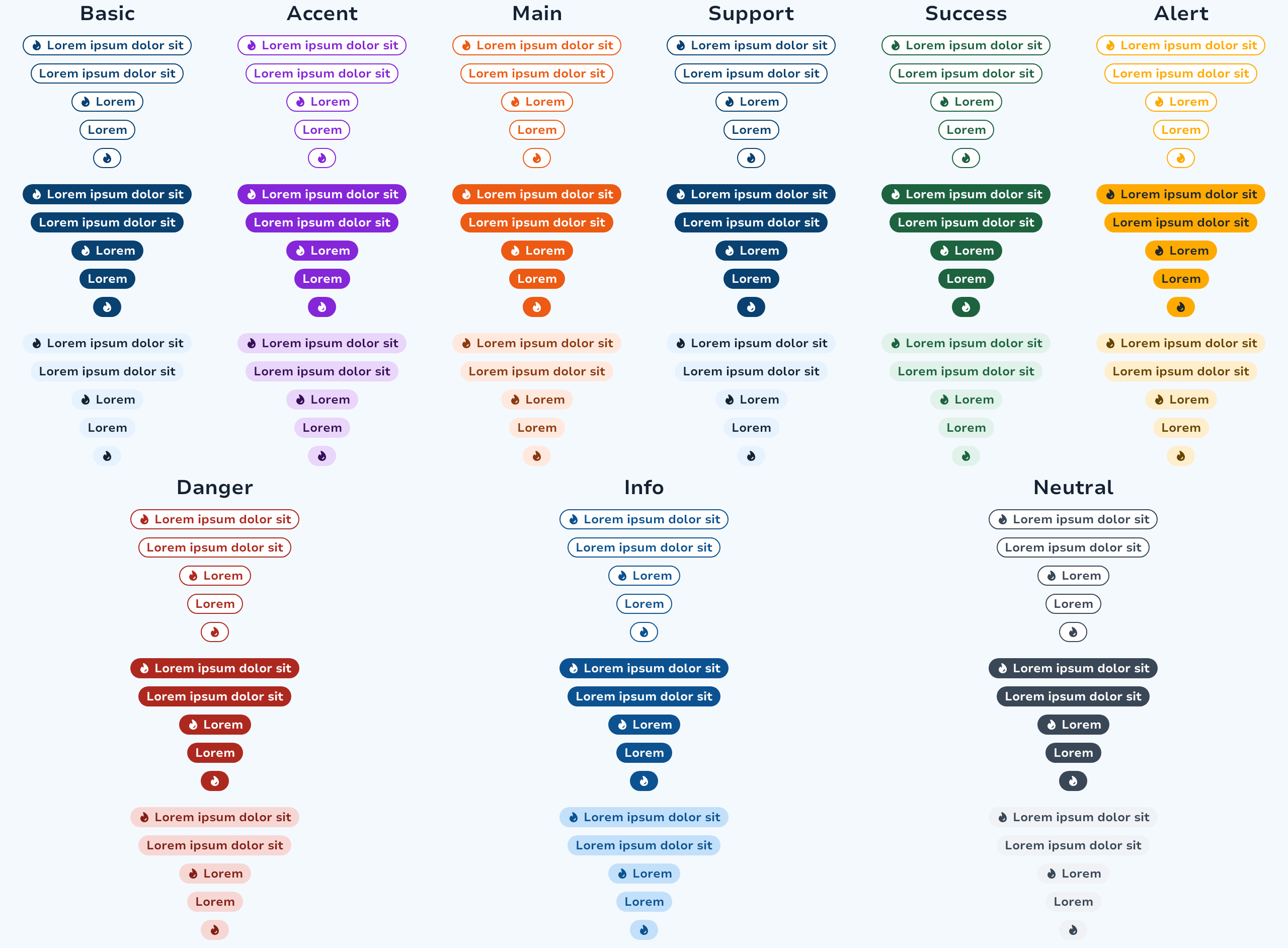 | 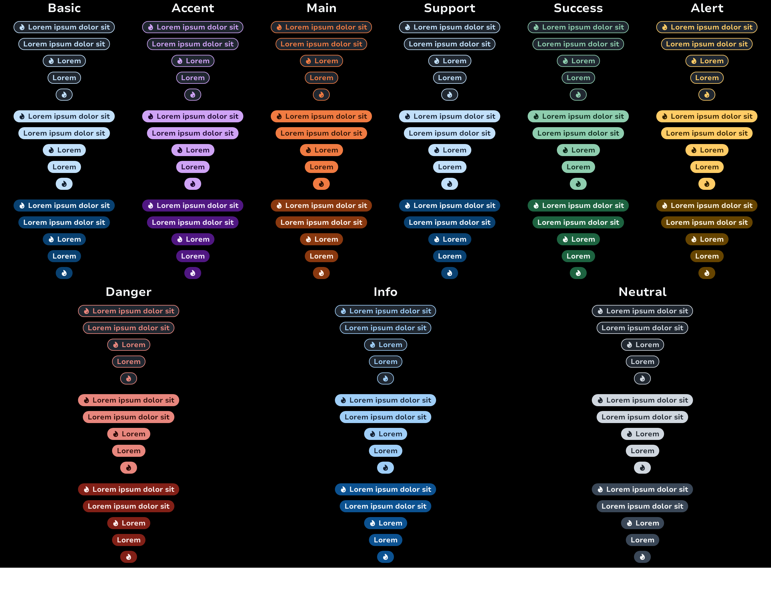 |
The minimal usage of the component is the text.
TagFilled(text = "Main")The tags can also have a decorative start icon to better identify the context of the tag.
Layout
We don't provide any container for now but we recommend using a FlowRow to layout it in your screens.
FlowRow(
    horizontalArrangement = Arrangement.spacedBy(8.dp),
    verticalArrangement = Arrangement.spacedBy(8.dp),
    maxItemsInEachRow = 4,
) {
    TagFilled(text = "Tag 1", intent = TagIntent.Main)
    TagFilled(text = "Tag longer 2", intent = TagIntent.Accent)
    TagFilled(text = "Tag a bit longer 3", intent = TagIntent.Info)
    TagTinted(text = "Tag way more longer 4", intent = TagIntent.Main)
    TagTinted(text = "Tag small 5", intent = TagIntent.Main)
    TagOutlined(text = "Tag 6", intent = TagIntent.Main)
}Tag Intent "Surface"
The Surface intent is designed to display tags on images or visually heavy surfaces. Important: The Surface intent can only be used with TagFilled. Using it with TagOutlined or TagTinted will result in an error.
TagFilled(text = "Featured", intent = TagIntent.Surface)Tag "Highlight"
The Highlight tag allows you to temporarily highlight new features of the product. It draws users attention to new features or important updates.
| Light | Dark |
|---|---|
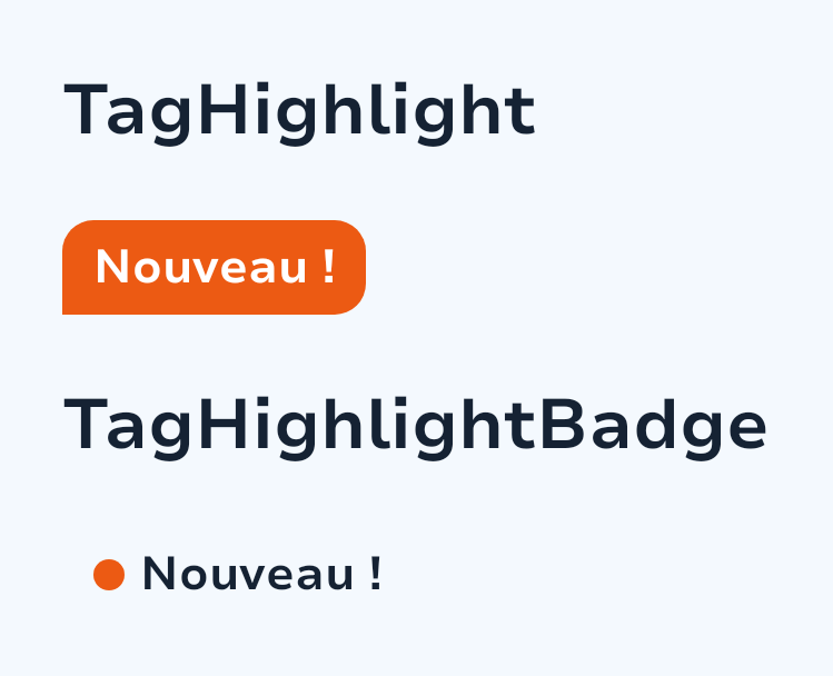 | 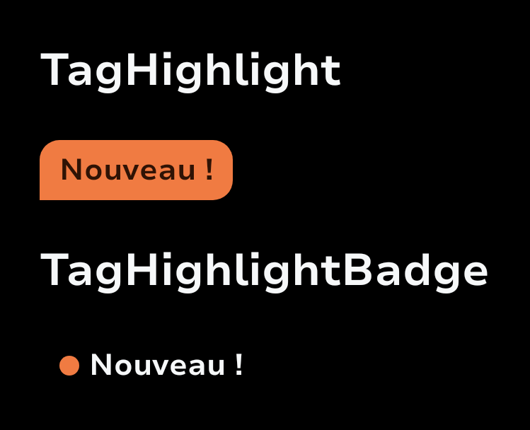 |
Important Usage Guidelines:
Use this component exceptionally to avoid visual overload
Always prioritize the elements being highlighted
Implement with an End-of-Life Remote Config to prevent indefinite production presence
TagHighlight()Types
Component tokens for tag components. Centralises all flag-driven token resolution so that tag composables read from a single source of truth instead of inlining the flag check at every call site. When the rebranding feature flag is eventually removed, only this file changes.
Functions
Filled tag represent main information
The Highlight tag is integrated into a card. It highlights new content and is placed at the top of the card so that users see it first. This component usages should remain exceptional and it is important to prioritize the elements highlighted in order to avoid visual overload.
The Highlight tag “Badge” is positioned as close as possible to the element to be highlighted, whether in a menu for a new entry or in an Adcard. This component usages should remain exceptional and it is important to prioritize the elements highlighted in order to avoid visual overload.
Outlined tag represent support information
Tinted tag represent support information like OutlinedTag