iconText
abstract fun iconText(icon: SparkIcon, text: String, selected: Boolean, iconOnTop: Boolean, onClick: () -> Unit, modifier: Modifier = Modifier): SegmentedButtonItem(source)
Segment showing a medium-sized SparkIcon above a single line of text.
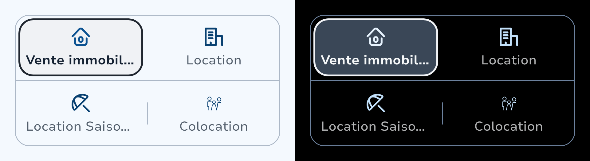
The icon colour animates between com.adevinta.spark.tokens.SparkColors.support when unselected and com.adevinta.spark.tokens.SparkColors.supportVariant when selected. The text uses the same animated style as singleLine.
Parameters
icon
Icon rendered above or beside the label.
text
Label displayed next to or below the icon, truncated with ellipsis.
selected
Whether this segment is currently selected.
iconOnTop
When true the icon is placed above the text. When false it is placed to the start (inline with the text).
onClick
Called when the user taps this segment.
modifier
Modifier applied to this segment's touch-target box.